
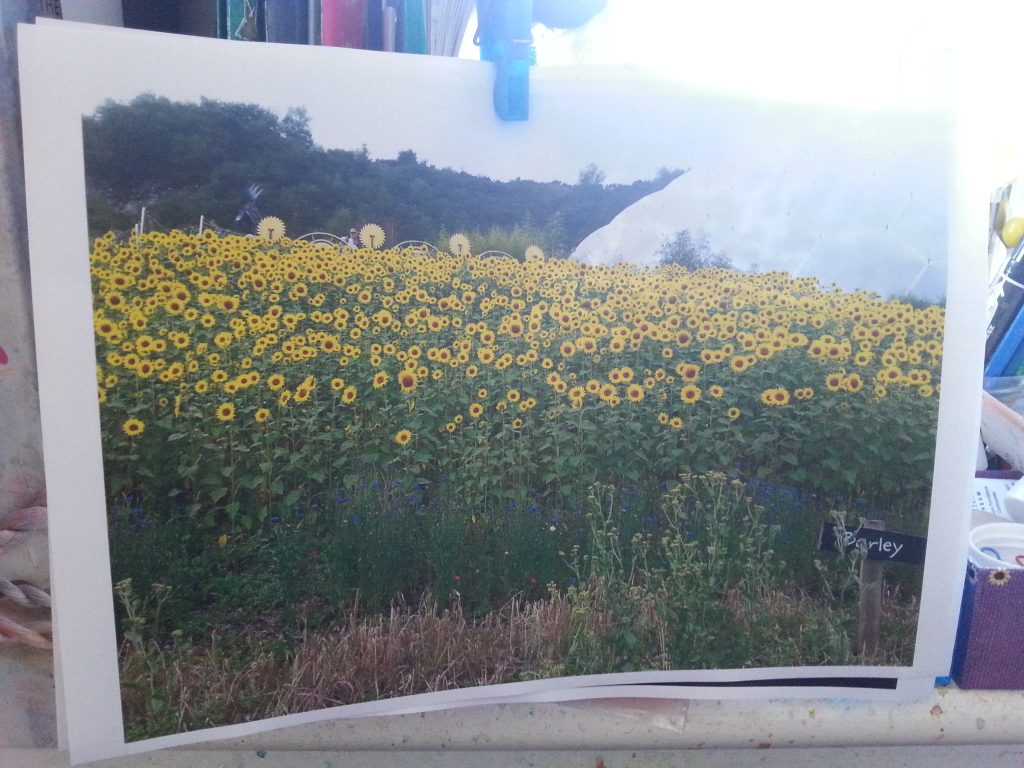
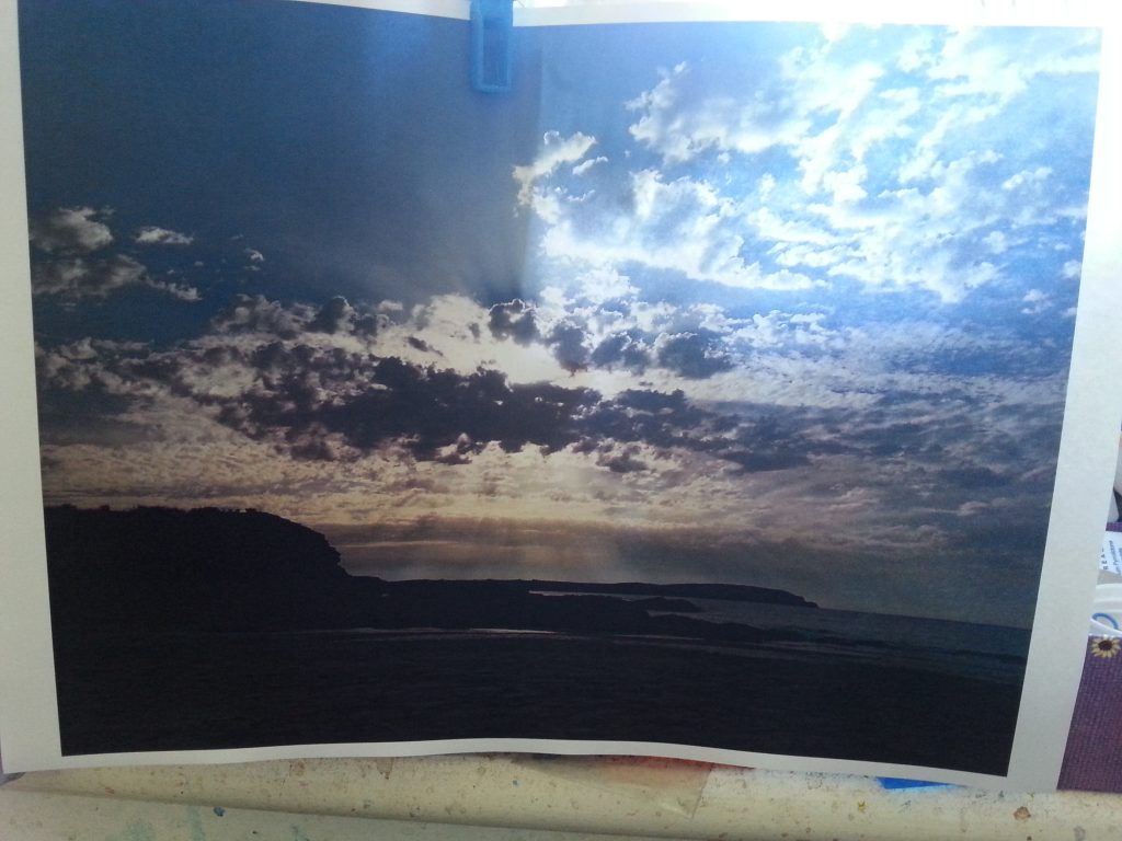
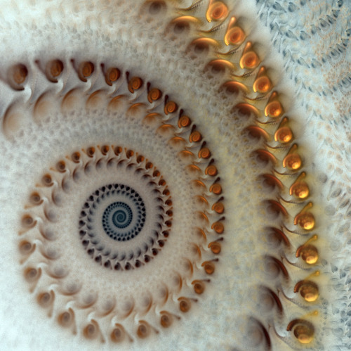
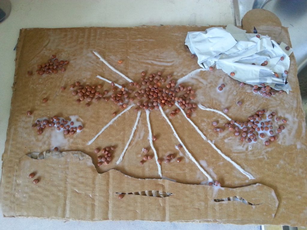
For this exercise I was keen to take on board the points for success as identified in Exercises One and Two. The key challenge for me was to select good images that would lend themselves well to interpretation in a collage print. I selected the following images and added for the fourth an interpretation of small blocks in an abstract arrangement:
-
- MMT Assignment 4 – Collatype – Exercise 3 – Collatype collage prints
-
- MMT Assignment 4 – Collatype – Exercise 2 – Polyfilla block
-
- MMT Assignment 4 – Collatype – Exercise 3 – Collatype collage prints
-
- MMT Assignment 4 – Collatype – Exercise 3 – Collatype collage prints
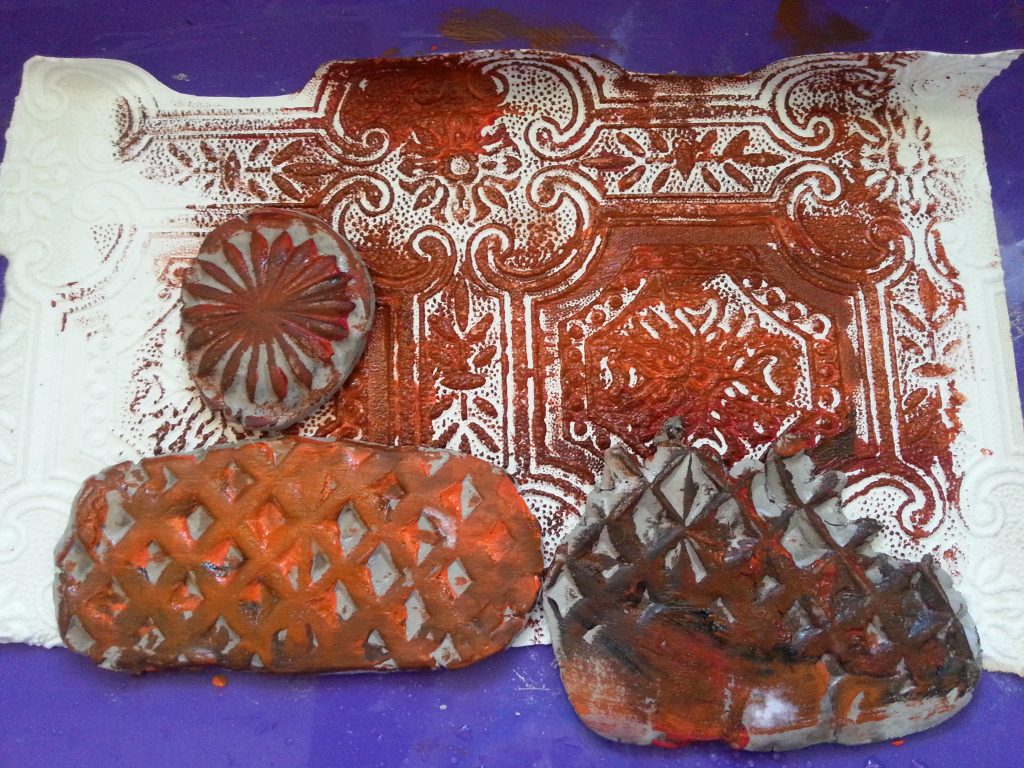
From these I produced the following blocks, bearing in mind the more successful collage pieces from earlier exercises:
-
- MMT Assignment 4 – Collatype – Exercise 3 – Collatype collage prints
-
- MMT Assignment 4 – Collatype – Exercise 3 – Collatype collage prints
-
- MMT Assignment 4 – Collatype – Exercise 3 – Collatype collage prints
-
- MMT Assignment 4 – Collatype – Exercise 2 – Polyfilla block
-
- MMT Assignment 4 – Collatype – Exercise 3 – Collatype collage prints
-
- MMT Assignment 4 – Collatype – Exercise 3 – Collatype collage prints
-
- MMT Assignment 4 – Collatype – Exercise 3 – Collatype collage prints
-
- MMT Assignment 4 – Collatype – Exercise 3 – Collatype collage prints
-
- MMT Assignment 4 – Collatype – Exercise 3 – Collatype collage prints
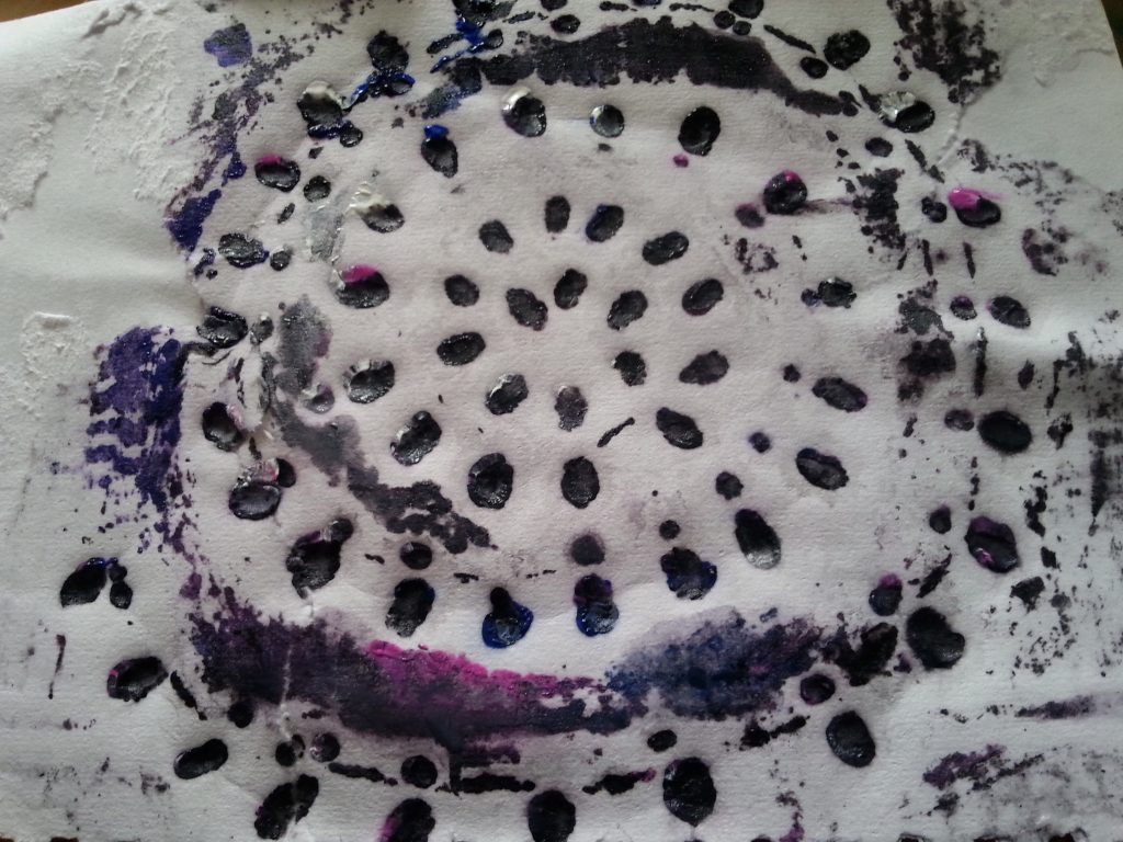
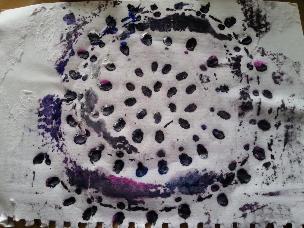
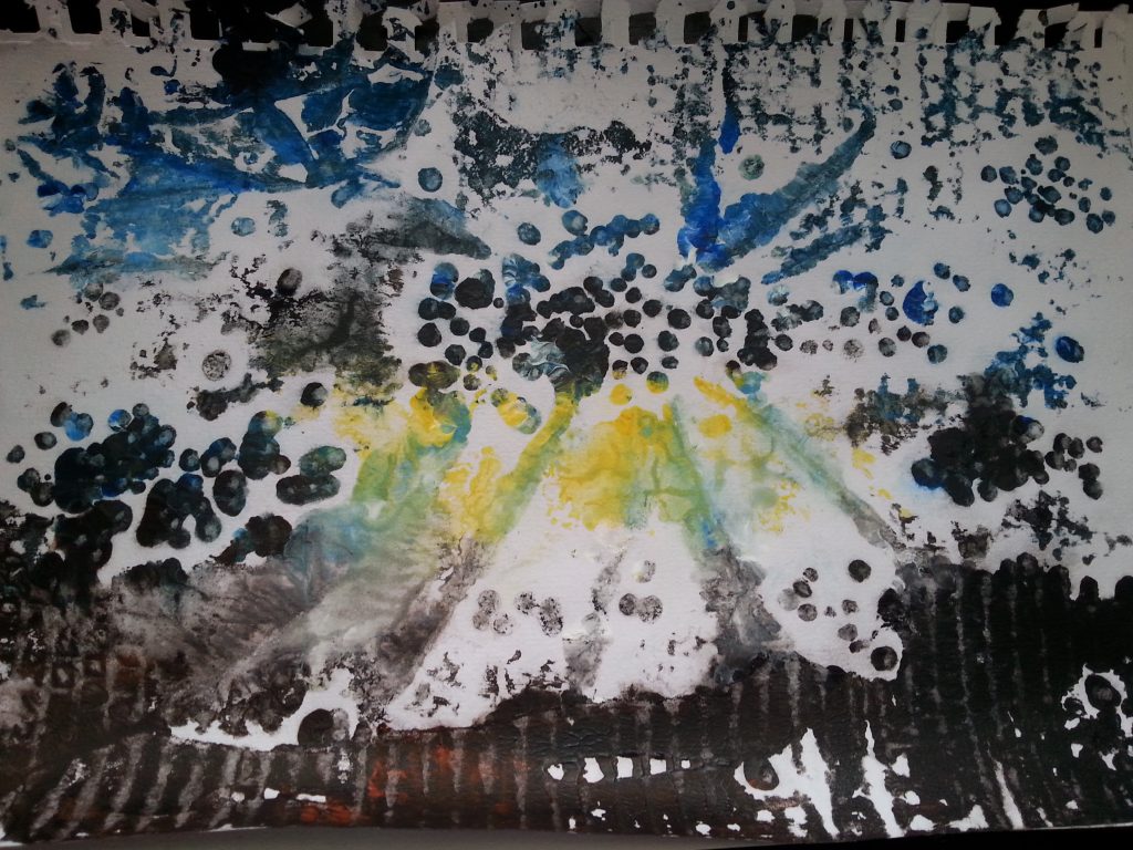
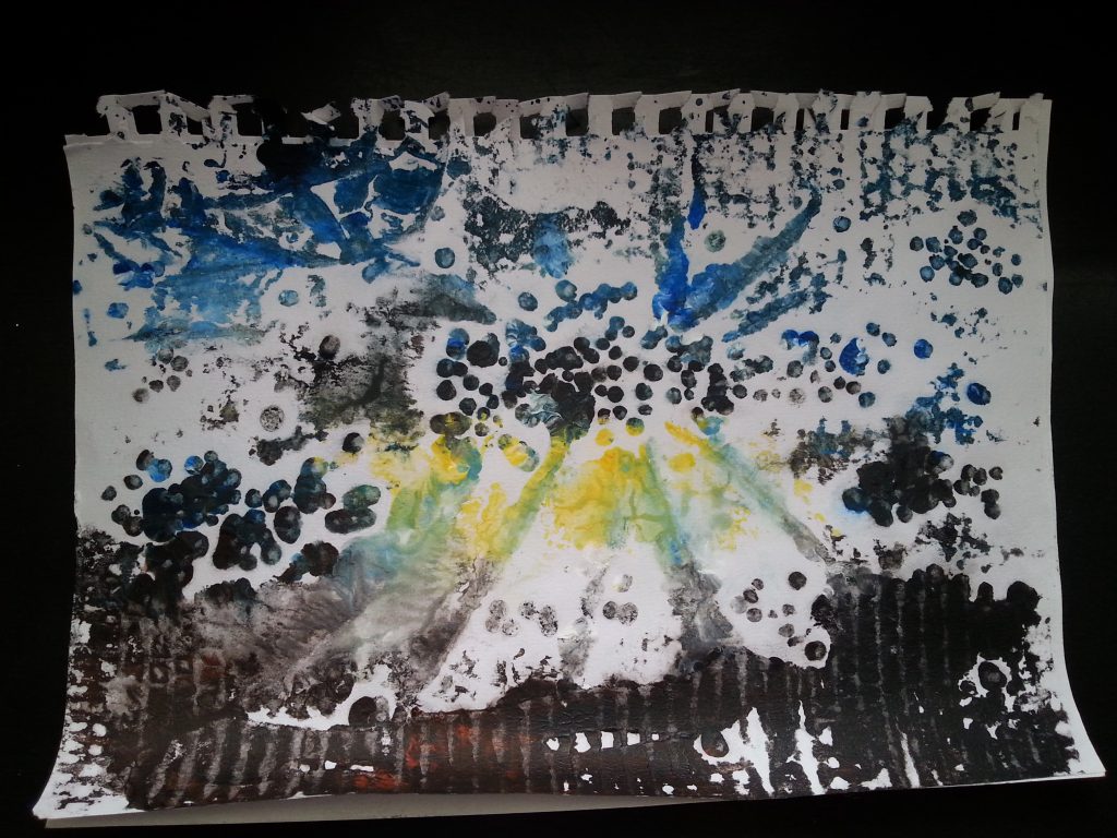
The blocks produced the following prints:
-
- MMT Assignment 4 – Collatype – Exercise 3 – Collatype collage prints
-
- MMT Assignment 4 – Collatype – Exercise 3 – Collatype collage prints
-
- MMT Assignment 4 – Collatype – Exercise 3 – Collatype collage prints
-
- MMT Assignment 4 – Collatype – Exercise 3 – Collatype collage prints
-
- MMT Assignment 4 – Collatype – Exercise 3 – Collatype collage prints
-
- MMT Assignment 4 – Collatype – Exercise 3 – Collatype collage prints
-

- MMT Assignment 4 – Collatype – Exercise 3 – Collatype collage prints
-
- MMT Assignment 4 – Collatype – Exercise 3 – Collatype collage prints
Conclusion
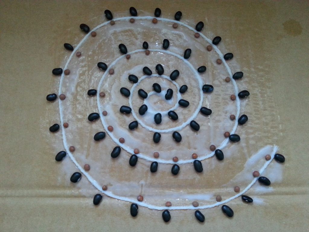
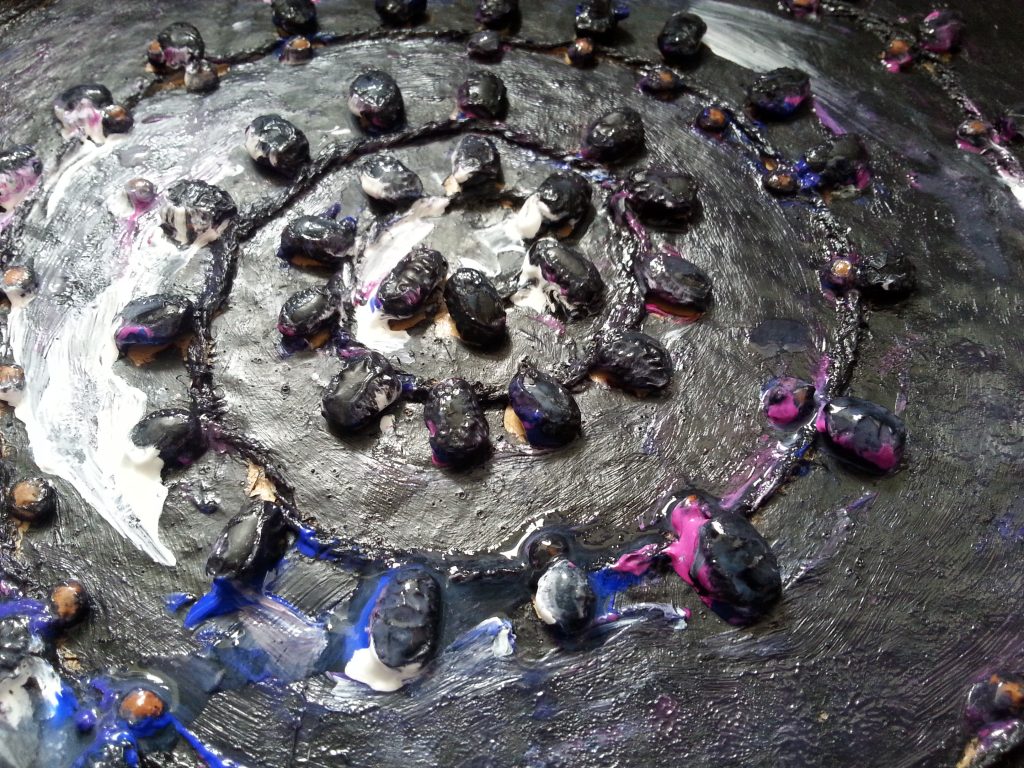
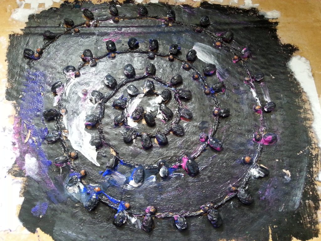
The black beans (spiral design) were not really flat enough and the spiral was not as clear as I had anticipated. Adding a thicker string (I used yarn) might have given better form in this sample.
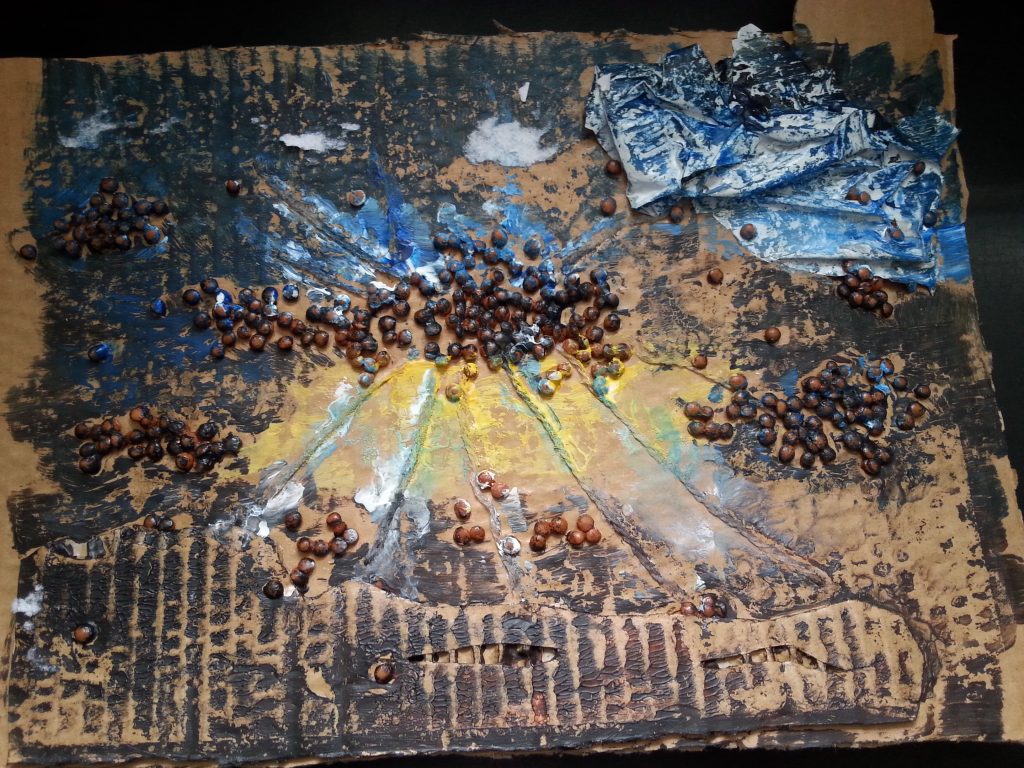
Sample two bears very little resemblance to the image. The paint colours are too bright and I was trying to capture shapes that were too indistinct. The background colour has barely printed at all which I can only presume to be due to a lack of pressure in those areas, possibly caused by too many raised sections of collage. The ridges that became visible through the cardboard were also an unexpected and unwanted element in the print. They draw the eye and are in complete conflict with the lines of the cliffs/shoreline in the image.
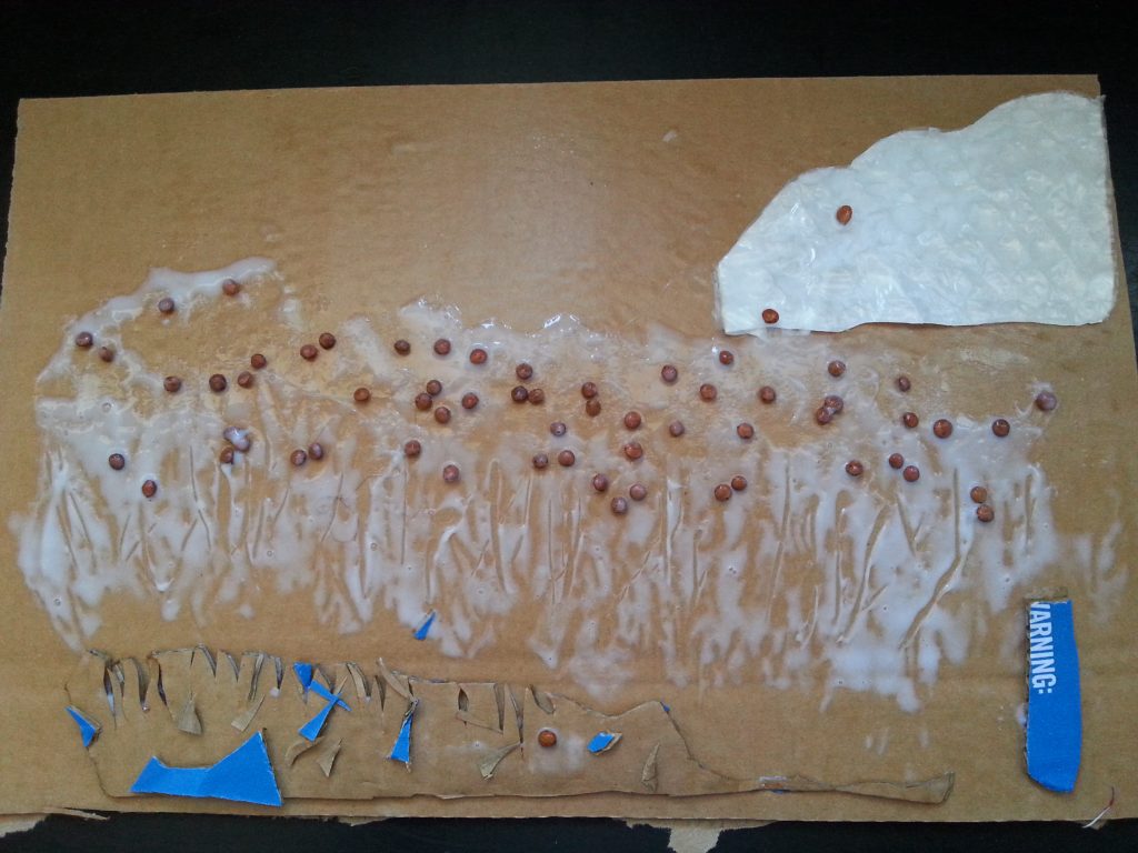
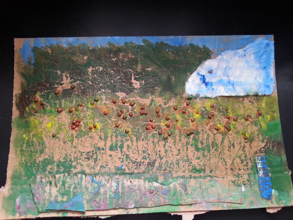
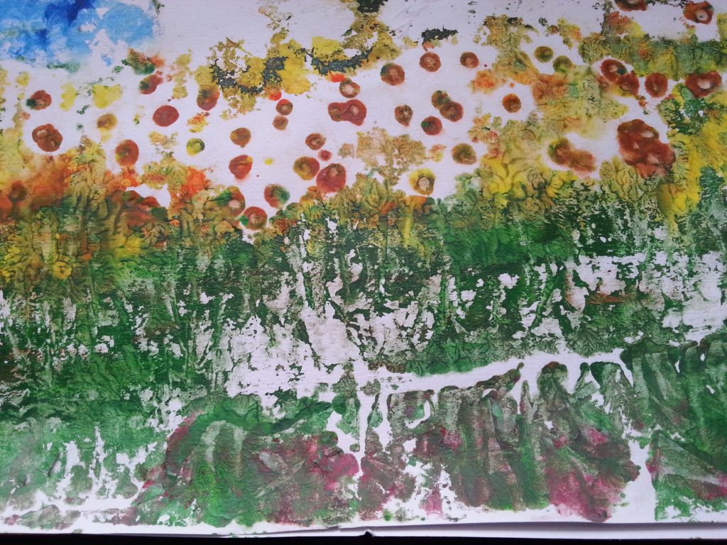
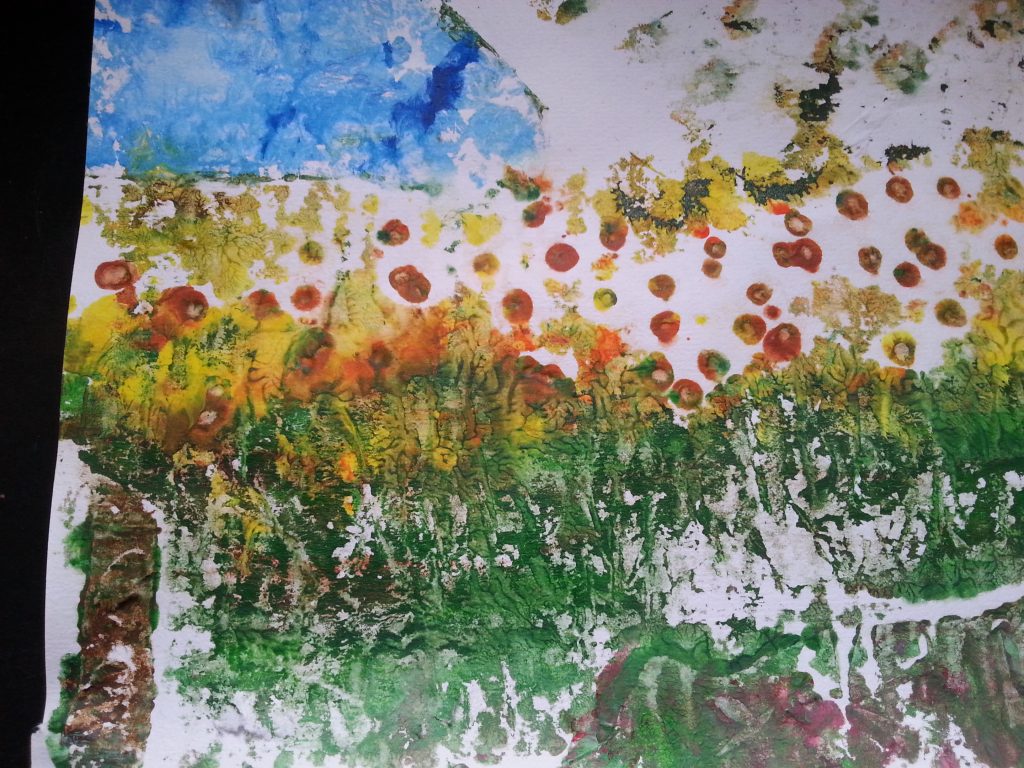
Example three was the most successful of the four pieces, both in terms of being a recognisable interpretation of the original image, use of colour and creation of areas of shape. I was particularly pleased with the areas of grass which were created by applying a thick layer of pva and scoring it when partially set with a toothpick to give the impression of waving grasses.
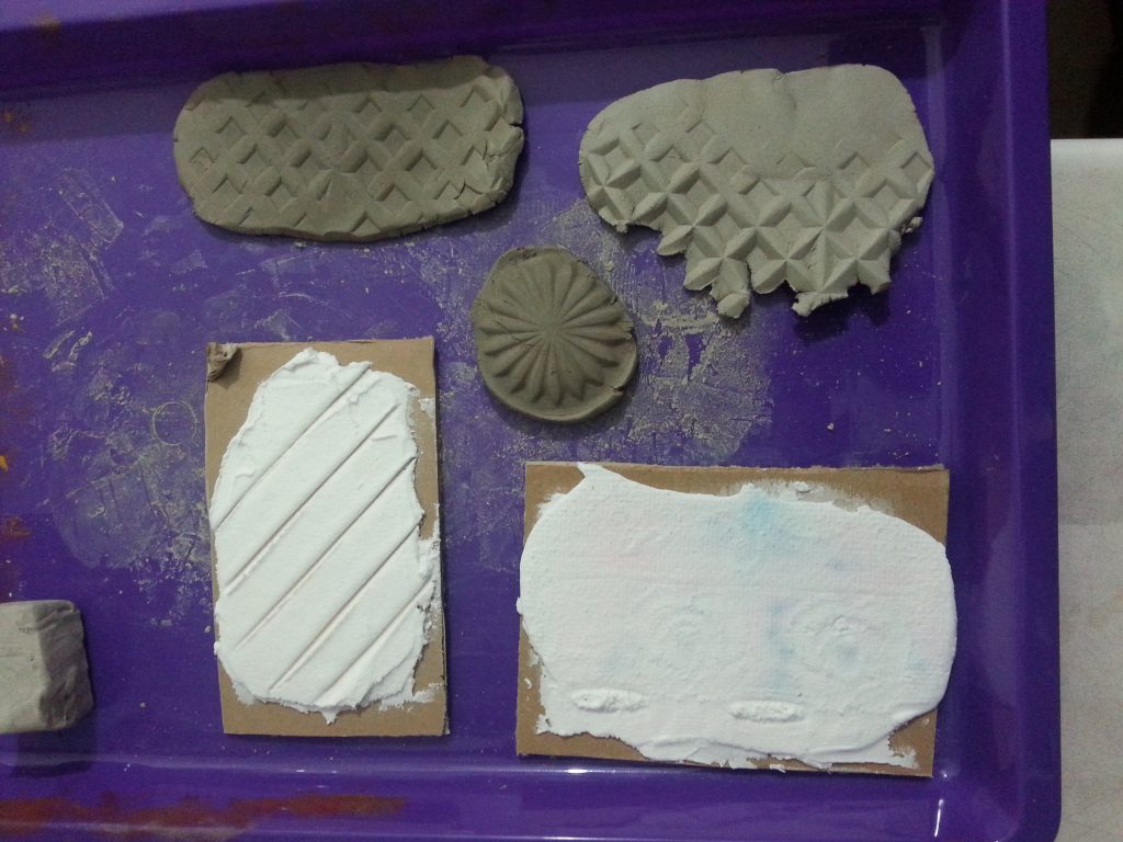
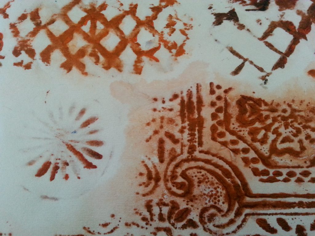
The fourth sample is quite pleasing. I used air-drying clay to make the honeycomb shapes, taking inspiration from the success of making imprints into this clay in the moulding and casting exercise (Assignment 3). I used the vase from the same assignment which made excellent impressions in the soft form paste and was equally successful here. I was surprised that the piece of anaglypta wallpaper gave such a strong print, retaining much of the original detail despite having a very soft surface and the relatively low depth of the raised section.
Final conclusion, reflection and ideas for future projects
In each sample I used the lessons learned regarding choice of paper, pre-wetting, how to apply pressure/brayering and choice of materials. I did introduce some new materials (cardboard, textured wallpaper, black beans, padded envelope) with mixed success. The single biggest learning experience from this exercise was that it is not necessary to create significant differences in levels. With the correct pressure, very slight changes in levels actually produce better results (pva, wallpaper, padded envelope). Other factors that I will take forward include creating a block with clearly defined shapes (unlike the spiral), careful attention to printing the background (not like example 2) and not trying to over-complicate/be too controlling over the block design.