-
- MMT Assignment 4 – Monoprinting – Exercise One – Mark-making
-
- MMT Assignment 4 – Monoprinting – Exercise One – Mark-making
-
- MMT Assignment 4 – Monoprinting – Exercise One – Mark-making
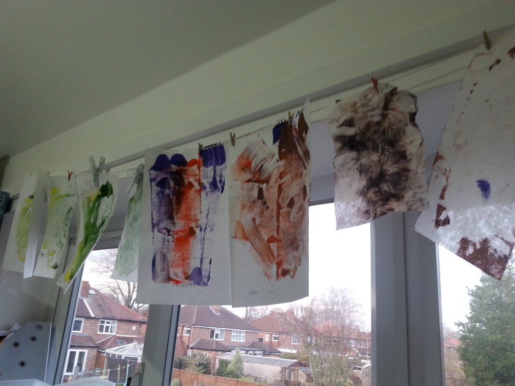
For this exercise I chose acrylic paints and used and the glass from and old picture frame as the plate. I printed onto:
- Printer paper
- Previously printed printer paper (waste paper from failed/duplicate printing)
- Tumble dryer sheets
- Wet wipes
- Cartridge sketchbook paper
- Coloured scrapbook paper
- Undyed calico fabric
- Brown wrapping paper
- Aluminium foil
For the mark-making, I experimented with:
- Plastic lid
- Old credit card
- Lollipop stick
- End of a paintbrush
- Stiff hair dye brush
- Potato masher
- Scrumpled plastic
- Crumpled paper
I used a brayer to apply the paint to the tile, sometimes choosing a quick roll to retain some of each colour, other times using multiple rolls to blend the paints more thoroughly. In some cases I added more paint to pick out certain areas and to see if this would add interesting highlights. In some cases the rolling also created areas on the plate with no paint as I was interested to see how this would alter the prints.
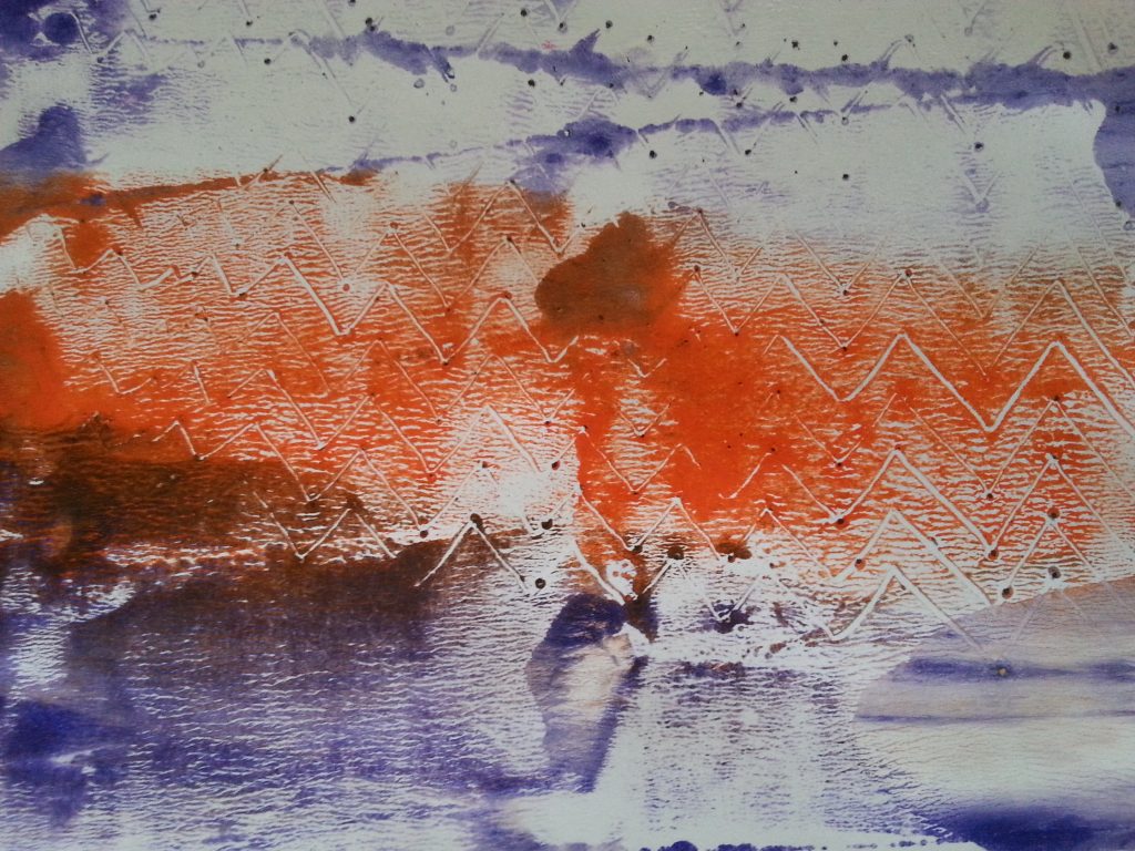
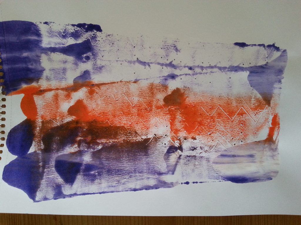
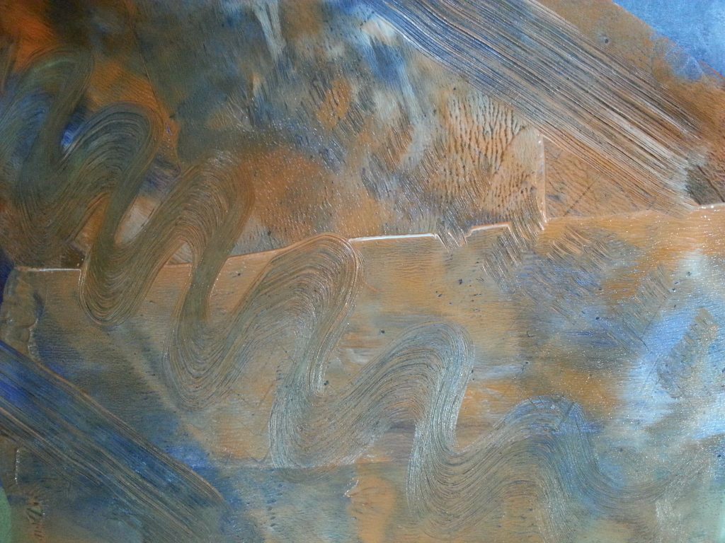
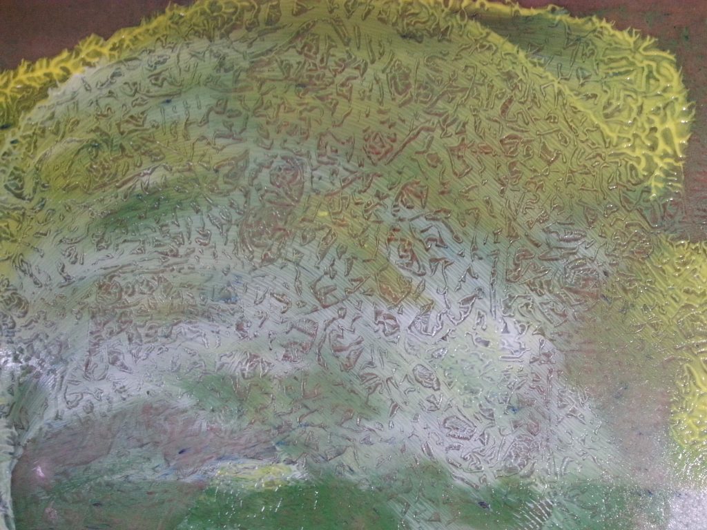
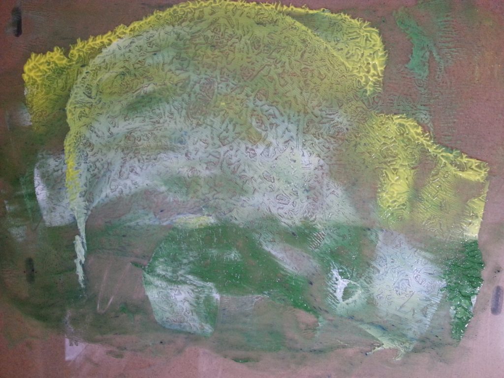
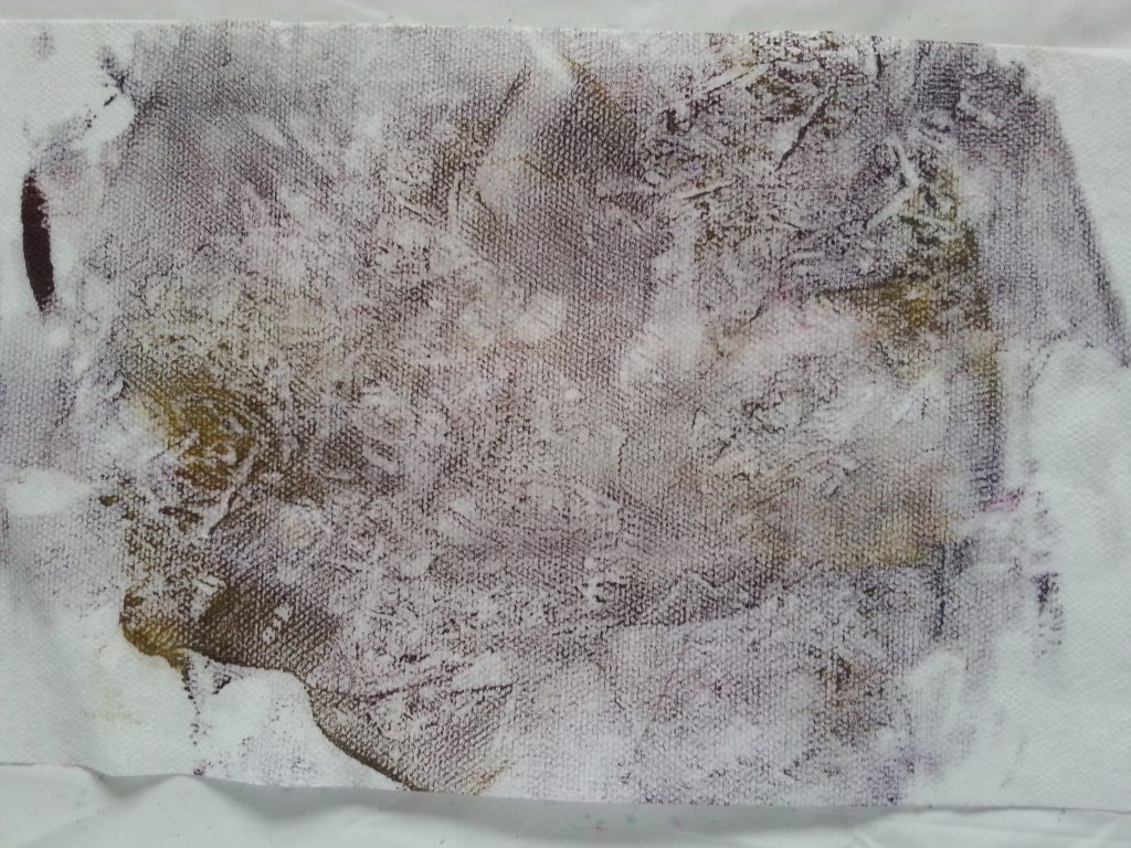
Plastic lid
-
- OCA MMT Assignment 4 – Monoprinting – Exercise One – Mark-making – Plastic lid
-
- OCA MMT Assignment 4 – Monoprinting – Exercise One – Plastic lid
-
- OCA MMT Assignment 4 – Monoprinting – Exercise One – Plastic lid
-

- OCA MMT Assignment 4 – Monoprinting – Exercise One – Plastic lid
-
- OCA MMT Assignment 4 – Monoprinting – Exercise One – Plastic lid
-
- OCA MMT Assignment 4 – Monoprinting – Exercise One – Mark-making – Plastic lid
-
- OCA MMT Assignment 4 – Monoprinting – Exercise One – Plastic lid
-
- OCA MMT Assignment 4 – Monoprinting – Exercise One – Plastic lid
-
- OCA MMT Assignment 4 – Monoprinting – Exercise One – Plastic lid
-
- OCA MMT Assignment 4 – Monoprinting – Exercise One – Mark-making – Plastic lid
-
- OCA MMT Assignment 4 – Monoprinting – Exercise One – Mark-making – Plastic lid
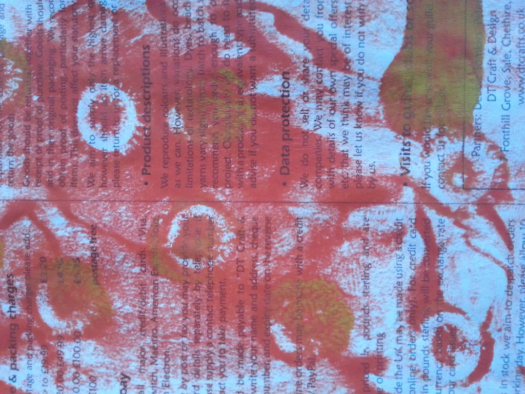
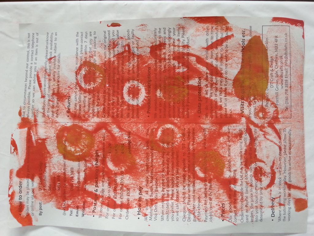
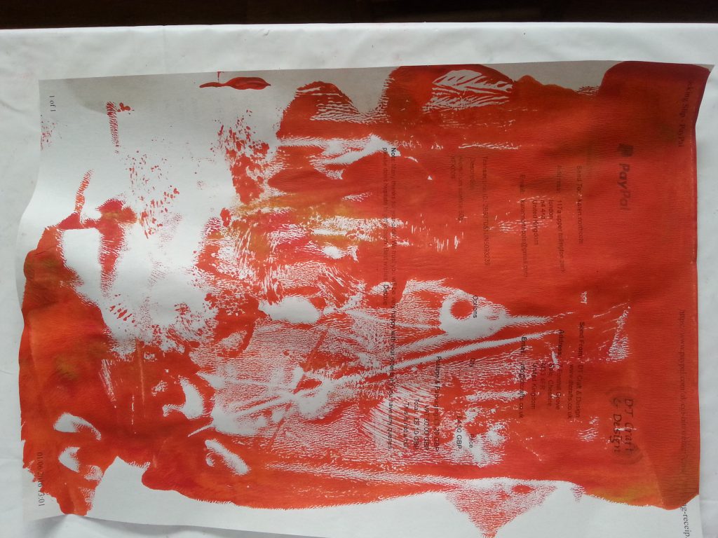
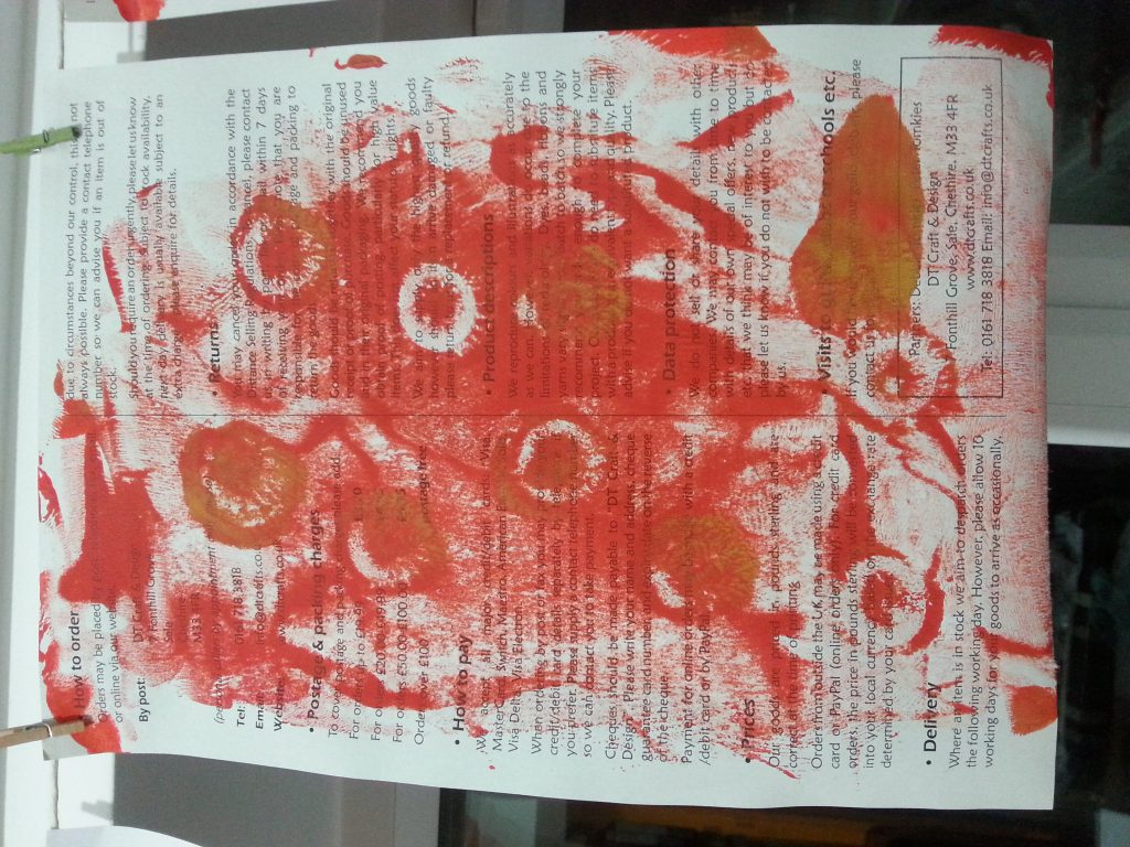
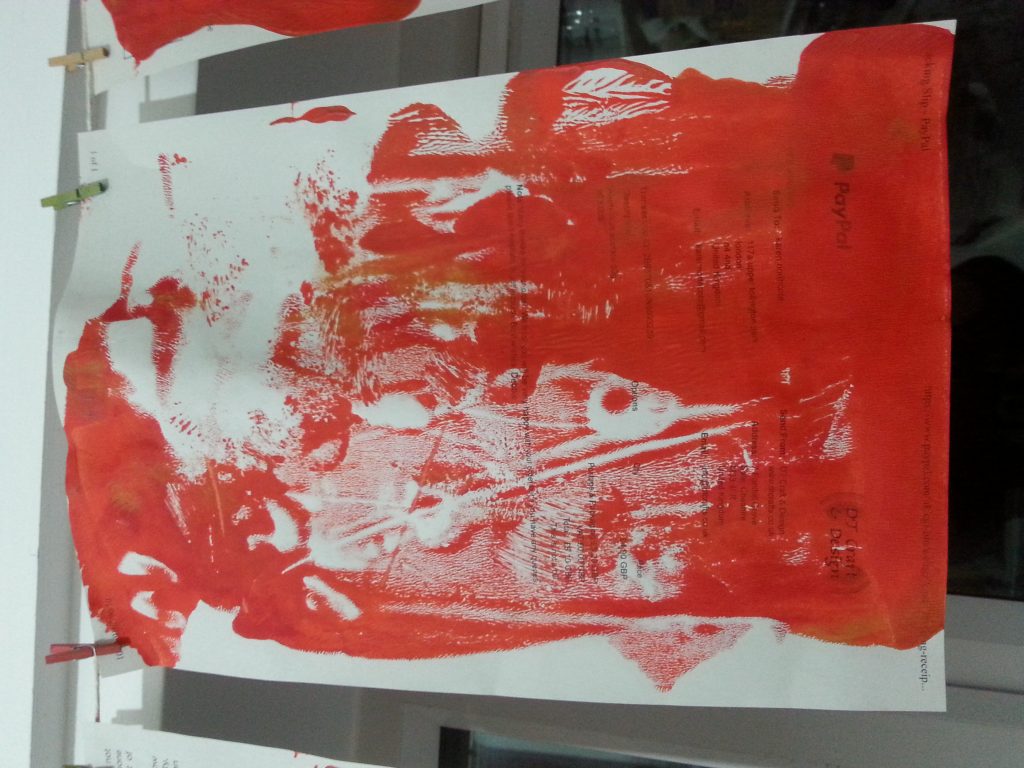
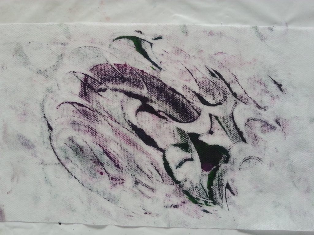
This was the first object I experimented with and in the earlier prints the paint was too thick, giving indistinct and splotchy results. Subsequent re-uses of the paint were more successful as there was less paint to obscure the images when they were pressed down. For these samples I used waste photocopier paper. I like pre-printed paper as it adds interest as well as recycling. When cut or torn the print becomes less legible but gives a hint of what is beneath, a layer of unknown mystery!
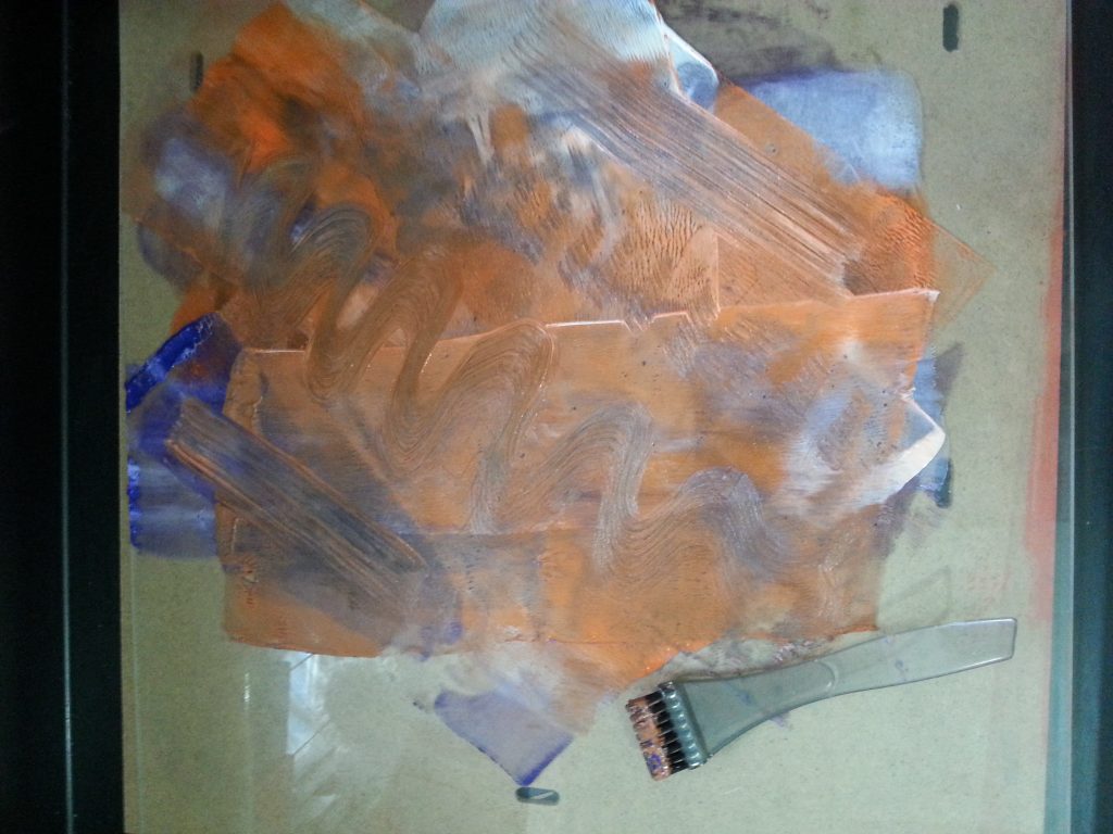
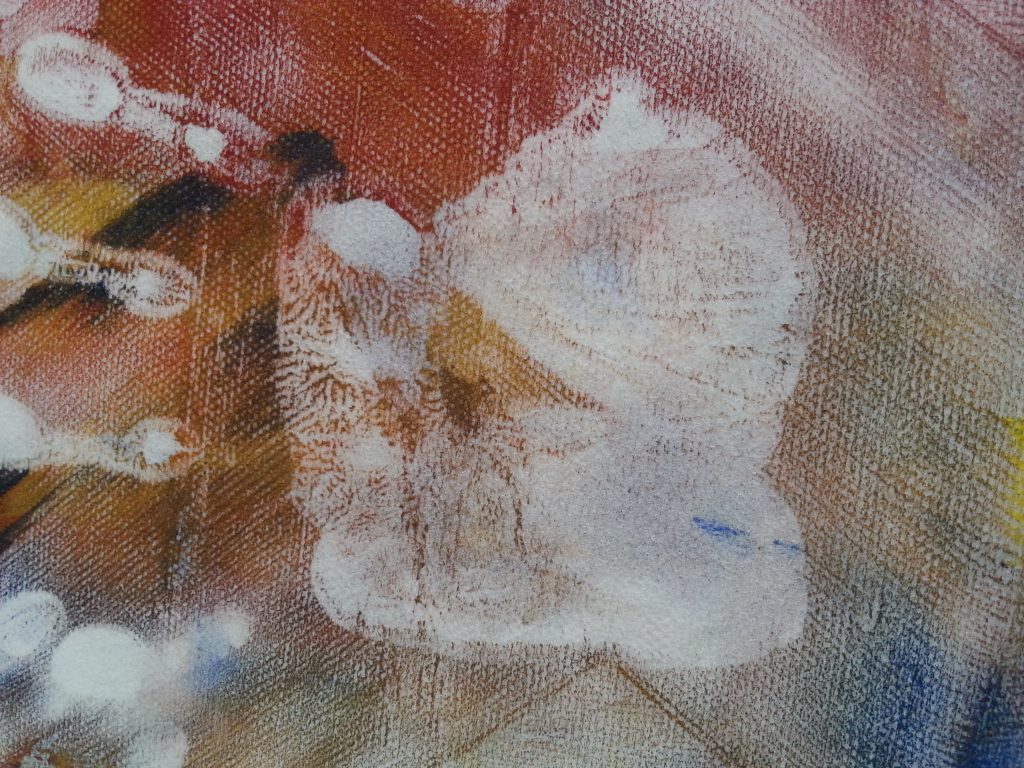
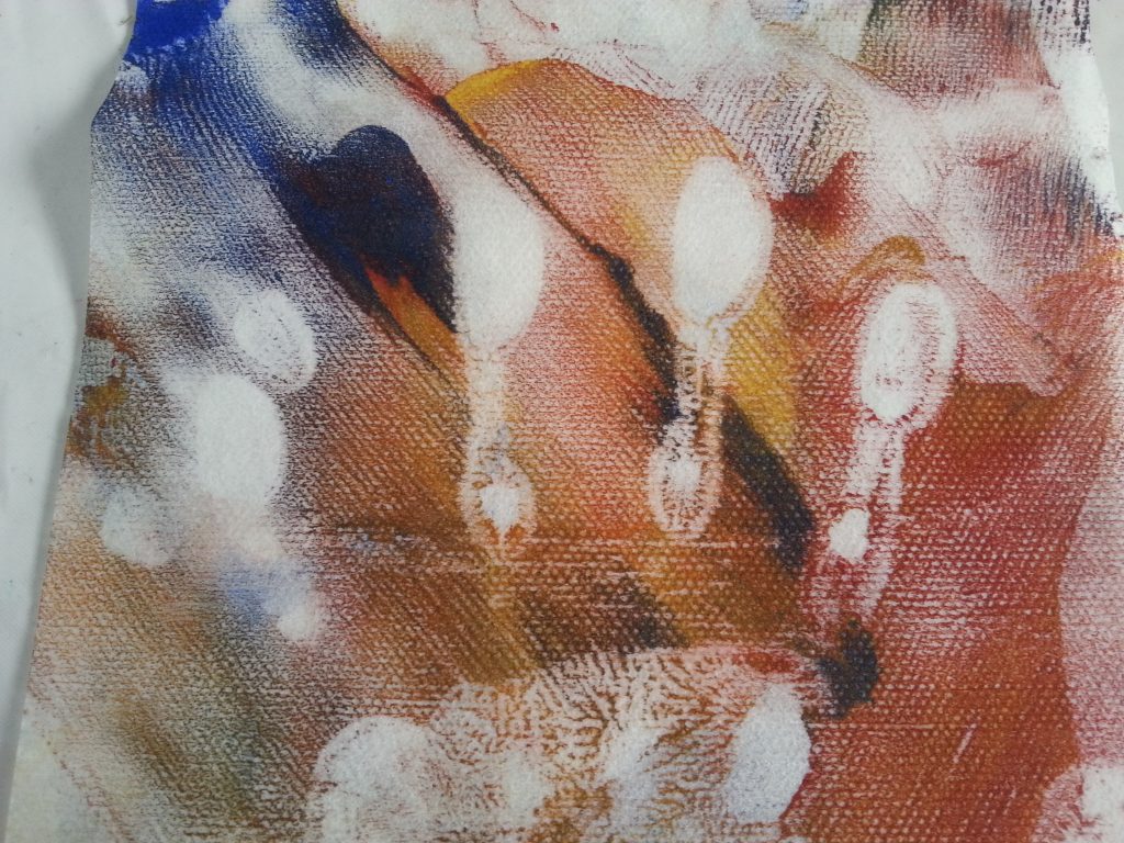
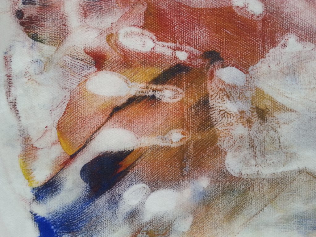
Credit card
-
- OCA MMT Assignment 4 – Monoprinting – Exercise One – Mark-making – Credit card
-
- OCA MMT Assignment 4 – Monoprinting – Exercise One – Mark-making – Credit card
-
- OCA MMT Assignment 4 – Monoprinting – Exercise One – Mark-making – Credit card
-
- OCA MMT Assignment 4 – Monoprinting – Exercise One – Mark-making – Credit card
-
- OCA MMT Assignment 4 – Monoprinting – Exercise One – Mark-making – Credit card
-
- OCA MMT Assignment 4 – Monoprinting – Exercise One – Mark-making – Credit card
-
- OCA MMT Assignment 4 – Monoprinting – Exercise One – Mark-making – Credit card
-
- OCA MMT Assignment 4 – Monoprinting – Exercise One – Mark-making – Paste spreader
-
- OCA MMT Assignment 4 – Monoprinting – Exercise One – Mark-making – Credit card
-
- OCA MMT Assignment 4 – Monoprinting – Exercise One – Mark-making – Credit card
-
- OCA MMT Assignment 4 – Monoprinting – Exercise One – Mark-making – Paste spreader
-
- OCA MMT Assignment 4 – Monoprinting – Exercise One – Mark-making – Credit card
-
- OCA MMT Assignment 4 – Monoprinting – Exercise One – Mark-making – Credit card
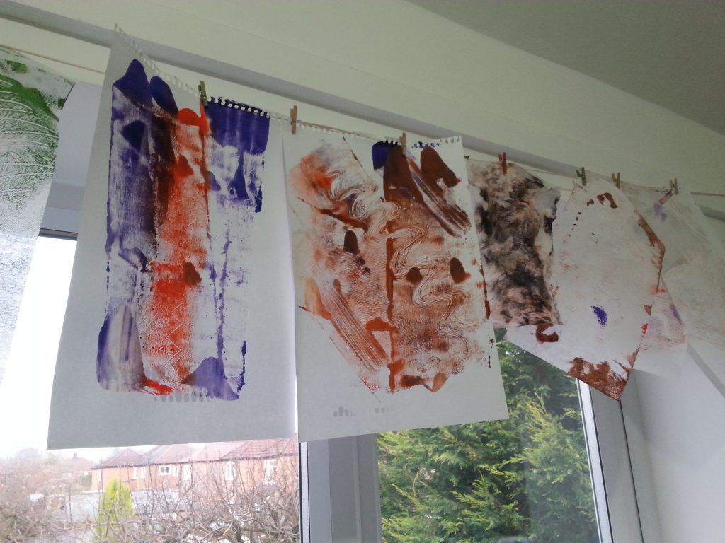
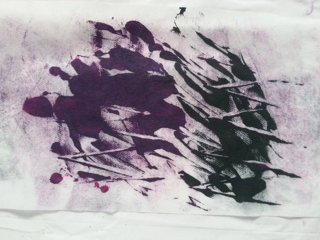
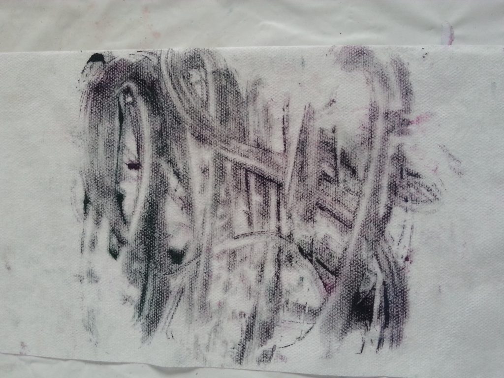
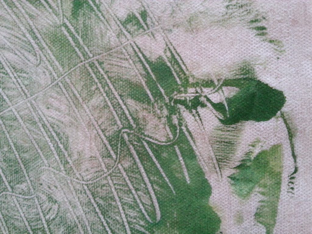
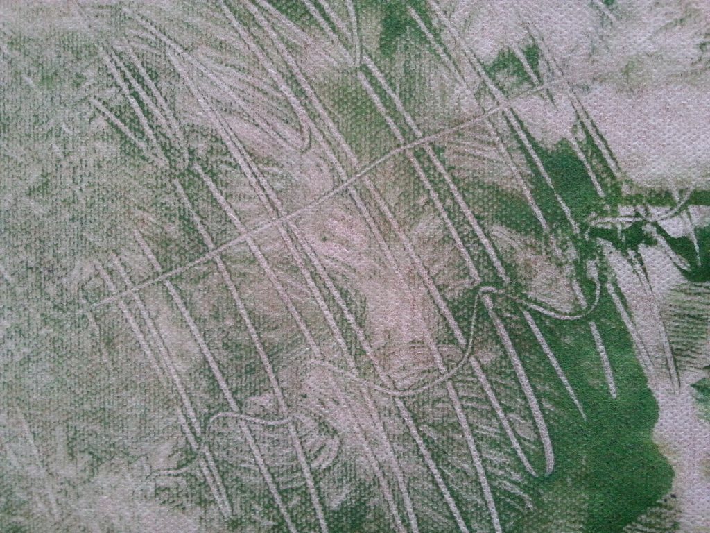
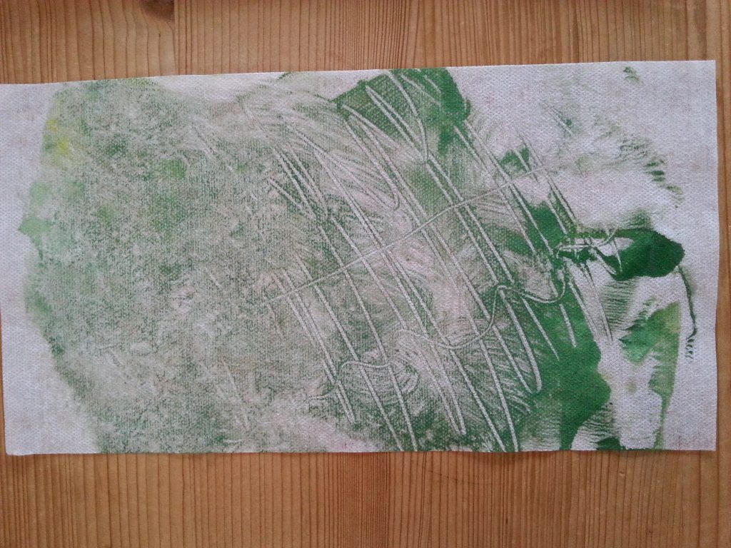
The credit card gave quite satisfying lines, sharp and distinct if used upright, but also made good curving, swooping lines if used at an angle. The corner could also be used to produce fine points , and for detailing. The green and yellow samples were made as second and subsequent prints, making them paler but still intersting. The imprint of the original paper also added further texture. The purple and dark green prints were made on tumble dryer sheets. The purple was too thick in places which obscured some of the lines in printing which was disappointing as the lined areas are quite effective. It may be possible to extract the good parts of these prints and combine with other pieces.
Lollipop stick
-
- OCA MMT Assignment 4 – Monoprinting – Exercise One – Lollipop Stick
-
- OCA MMT Assignment 4 – Monoprinting – Exercise One – Mark-making – Lollipop Stick
This was a print and second pull using a large lollipop on its long edge to pull through the paint. This was a satisfying, if simple print. It created the look of pleating or folding, with the areas without paint creating light highlights and the thicker painted areas forming deep shadows.
End of paintbrush
-
- OCA MMT Assignment 4 – Monoprinting – Exercise One – End of paintbrush
-
- OCA MMT Assignment 4 – Monoprinting – Exercise One – End of paintbrush
-
- OCA MMT Assignment 4 – Monoprinting – Exercise One – End of paintbrush
-
- OCA MMT Assignment 4 – Monoprinting – Exercise One – End of paintbrush
-
- OCA MMT Assignment 4 – Monoprinting – Exercise One – End of paintbrush
-
- OCA MMT Assignment 4 – Monoprinting – Exercise One – End of paintbrush
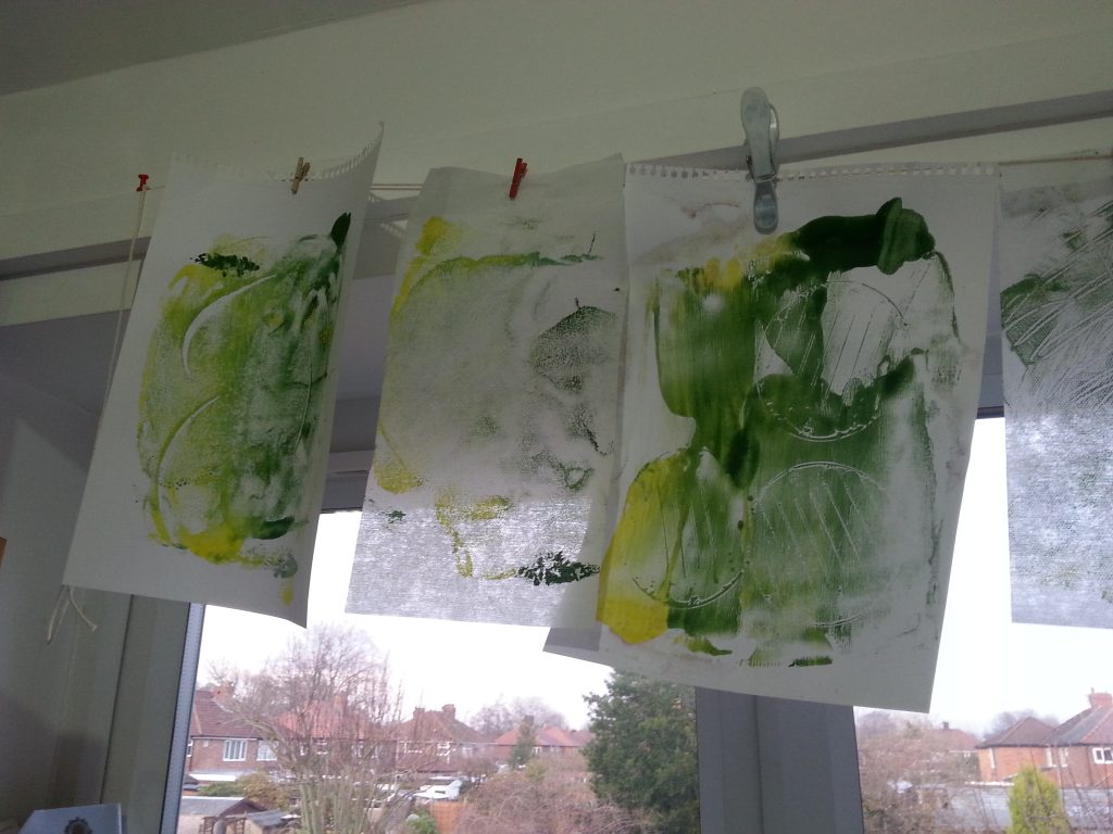
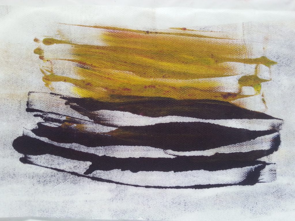
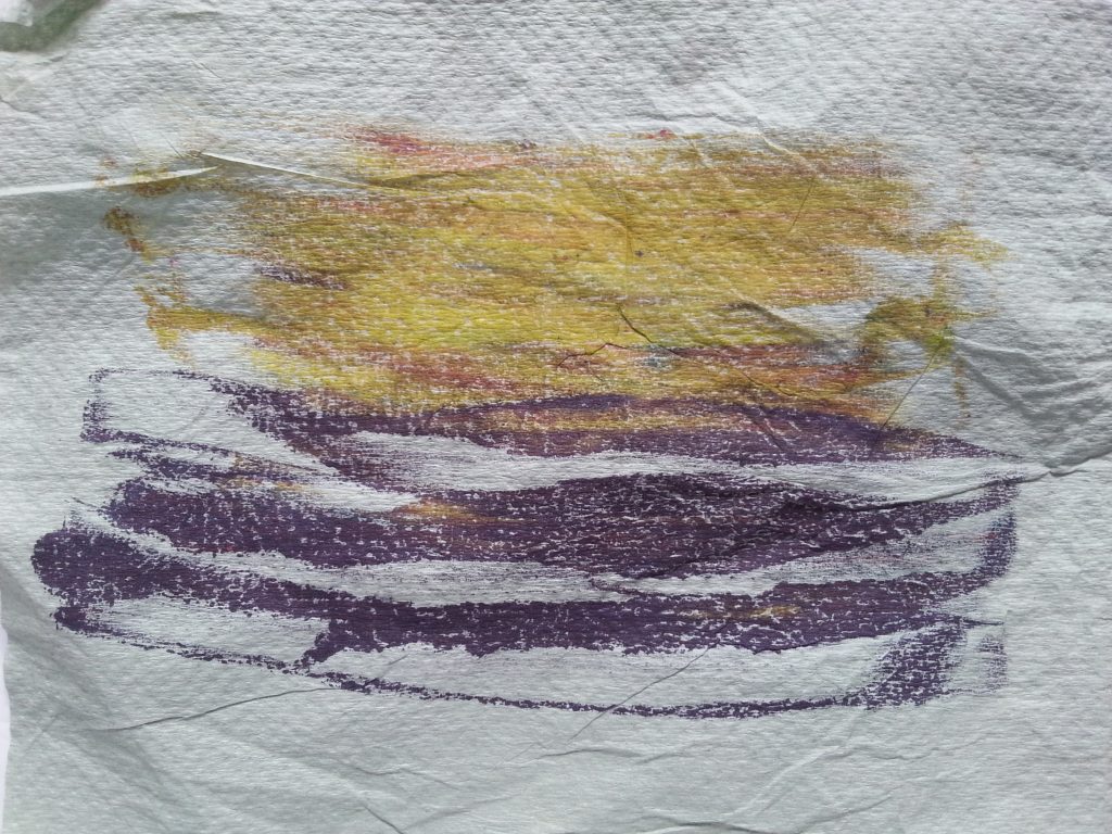
The paintbrush lines weren’t as interesting as I’d anticipated and were rather thin and uninspiring (purple and orange samples). Tilting the brush end gave a slightly thicker, more distinct line (green and yellow samples above). Possibly this would be suitable for detailing but otherwise I preferred some of the other tools.
Stiff hairdye brush
-
- MMT Assignment 4 – Monoprinting – Exercise One – Mark-making – Hairdye brush
-
- MMT Assignment 4 – Monoprinting – Exercise One – Mark-making – Hairdye brush
-
- MMT Assignment 4 – Monoprinting – Exercise One – Mark-making – Hairdye brush
-
- MMT Assignment 4 – Monoprinting – Exercise One – Mark-making – Hairdye brush
The brush gave some lovely, sweeping shapes in the paint. The fact that some of the paint was absorbed into the brush enabled it to create good, distinct shapes and prints.
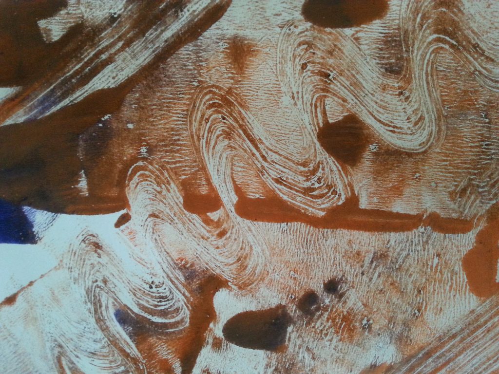
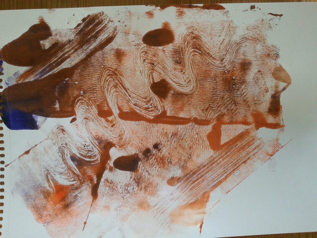
Potato masher
-
- MMT Assignment 4 – Monoprinting – Exercise One – Mark-making – Potato masher
-
- MMT Assignment 4 – Monoprinting – Exercise One – Mark-making – Potato masher
-
- MMT Assignment 4 – Monoprinting – Exercise One – Mark-making – Potato masher
This was an experiment to see if I could apply sufficient pressure to and old potato masher to get a ‘readable’ print, retaining as much of the texture of the masher as possible. With the right amount of paint this was a pleasingly successful experiment. The print produced good lines and repeat prints/overprinting gives the scope for exciting patterns.
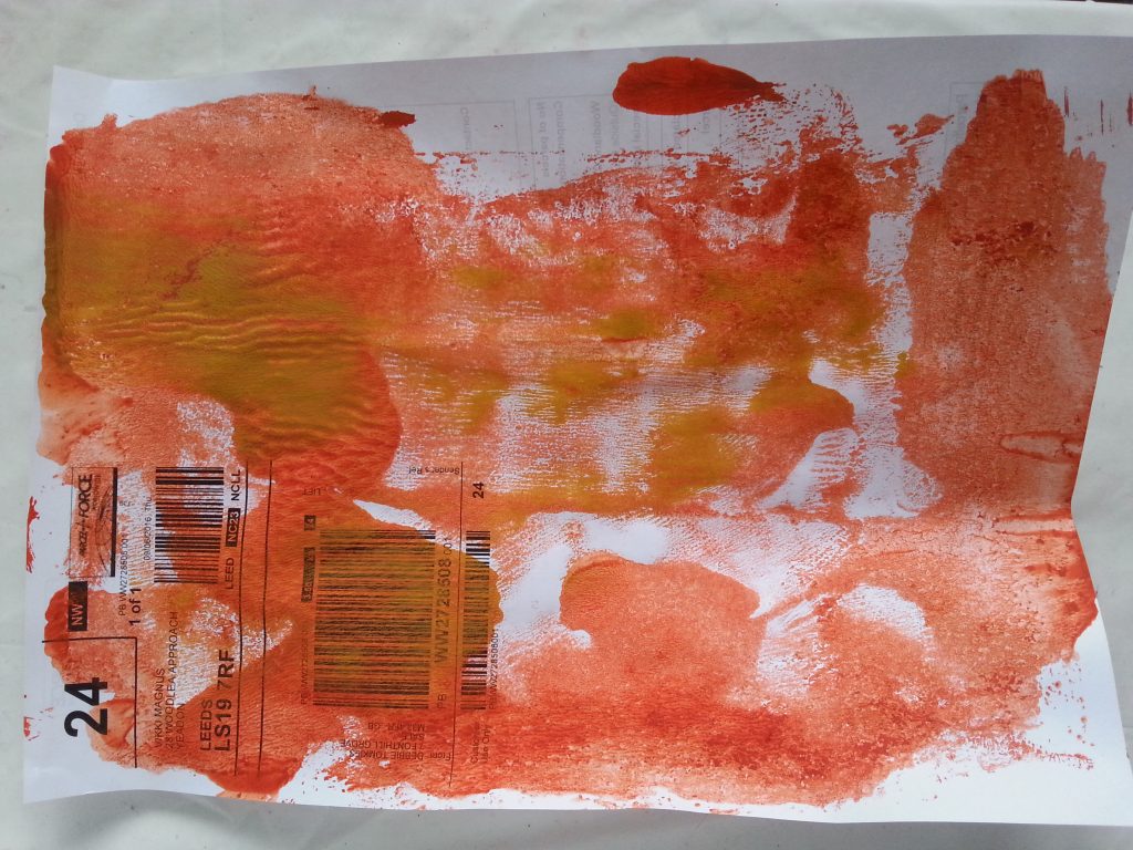
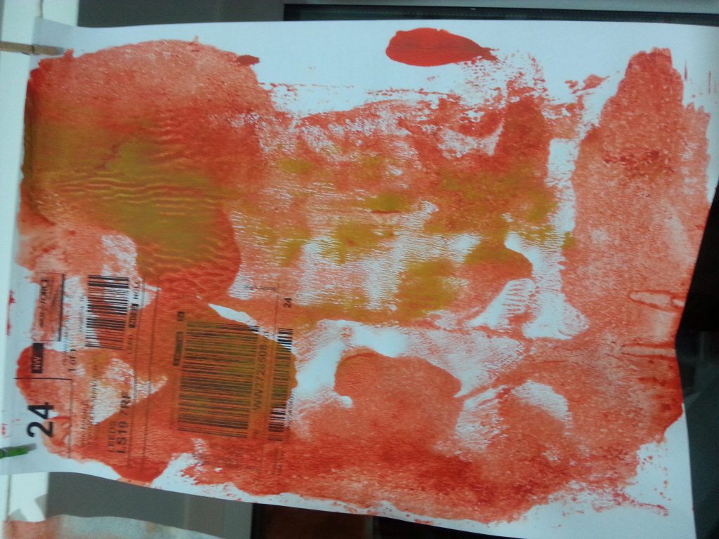
Scrumpled plastic
-
- MMT Assignment 4 – Monoprinting – Exercise One – Mark-making – Scrumpled plastic
-
- MMT Assignment 4 – Monoprinting – Exercise One – Mark-making – Scrumpled plastic
-
- MMT Assignment 4 – Monoprinting – Exercise One – Mark-making – Scrumpled plastic
-
- MMT Assignment 4 – Monoprinting – Exercise One – Mark-making – Scrumpled plastic
-
- MMT Assignment 4 – Monoprinting – Exercise One – Mark-making – Scrumpled plastic
-
- OCA MMT Assignment 4 – Monoprinting – Exercise One – Mark-making – Scrumpled plastic
-
- OCA MMT Assignment 4 – Monoprinting – Exercise One – Mark-making – Scrumpled plastic
-
- OCA MMT Assignment 4 – Monoprinting – Exercise One – Mark-making – Scrumpled plastic
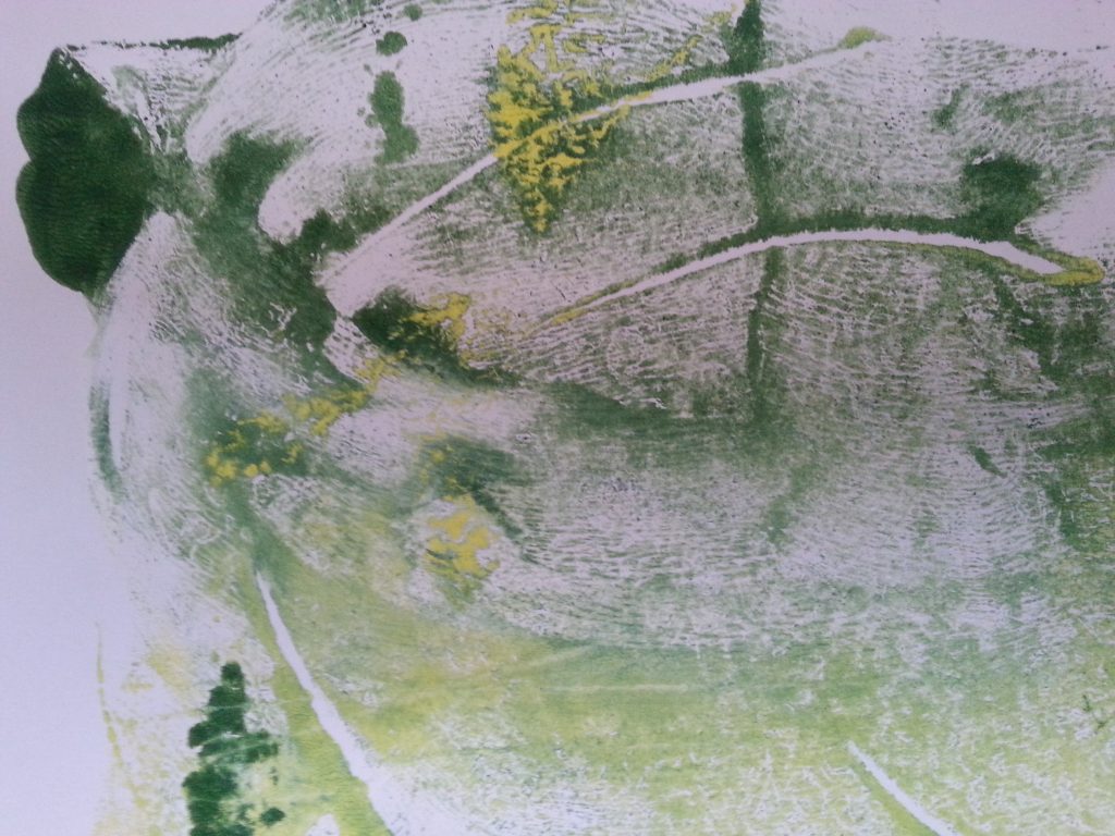
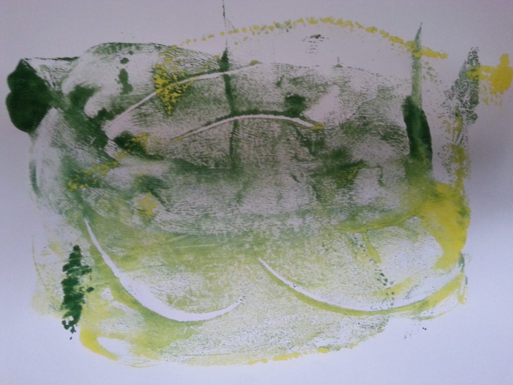
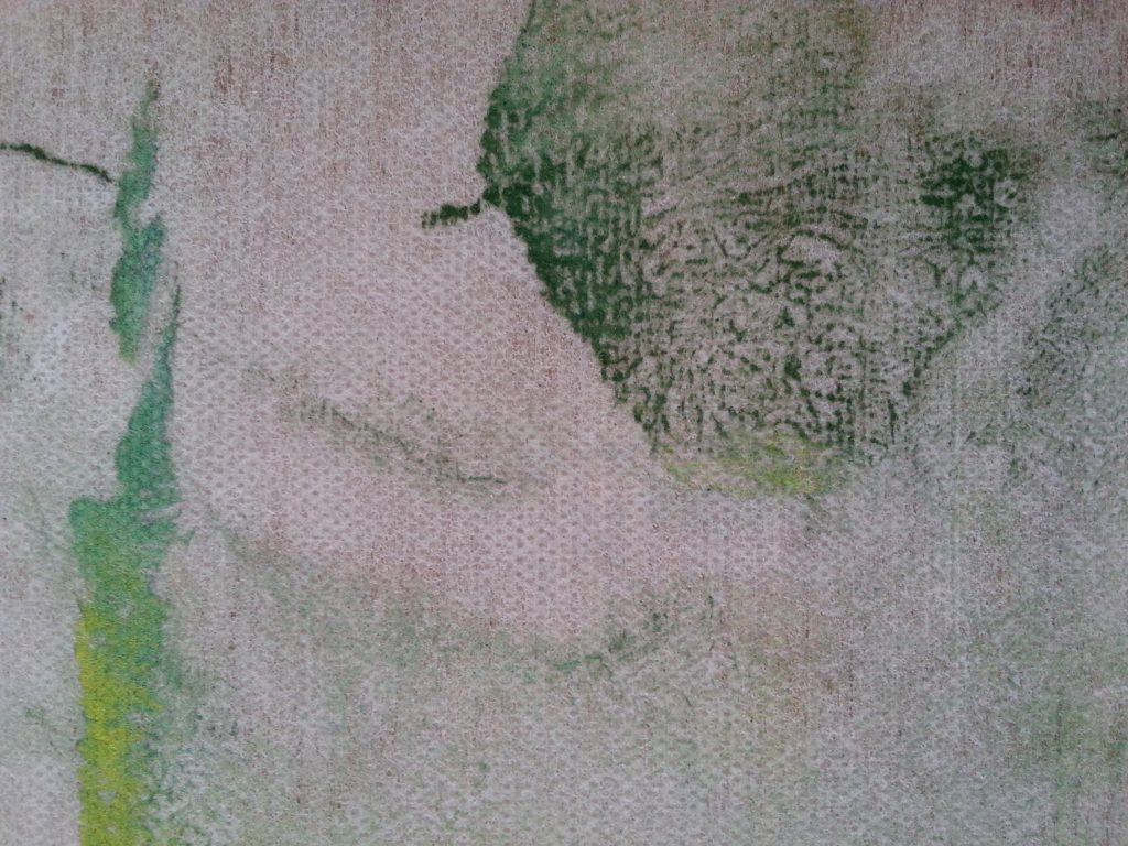
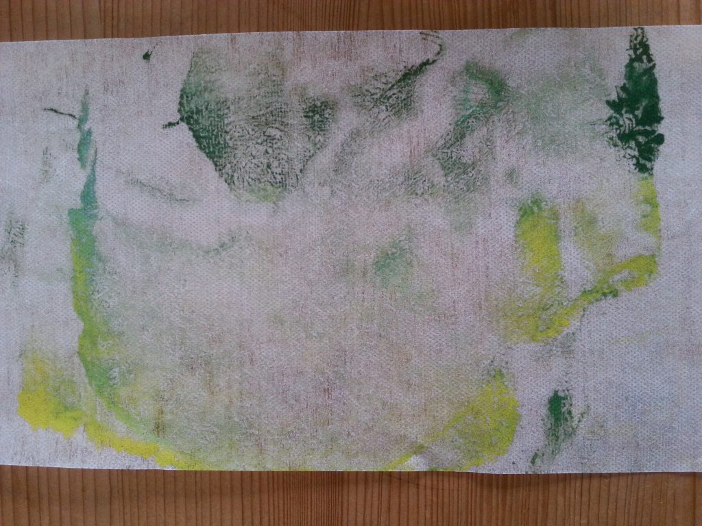
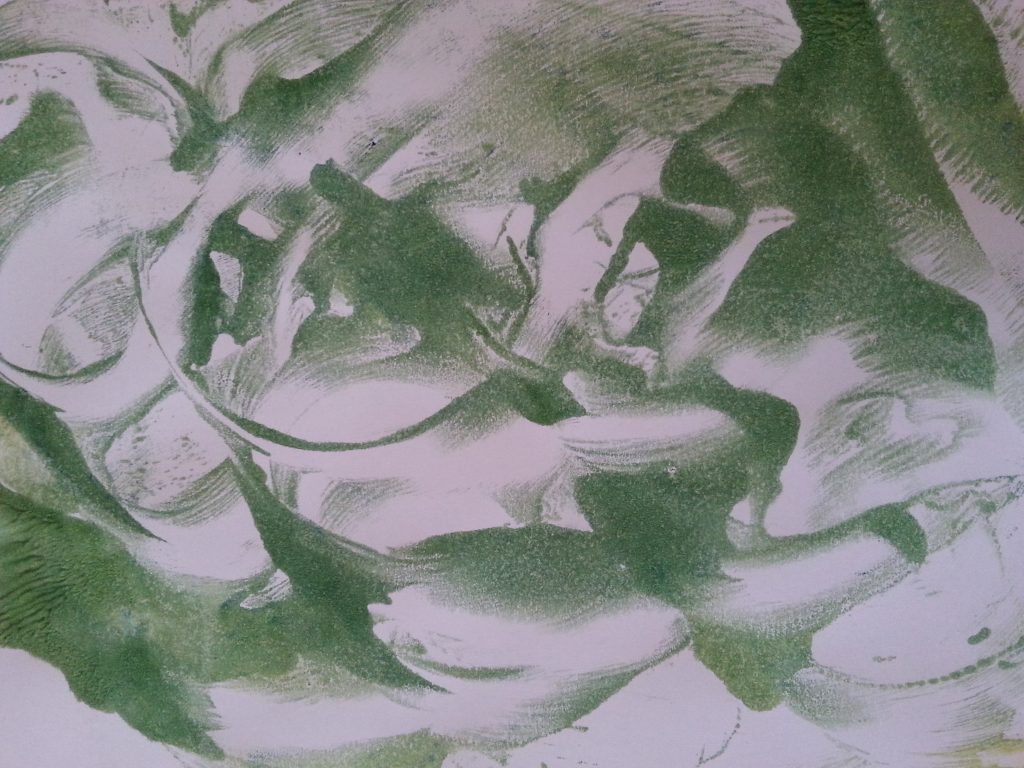
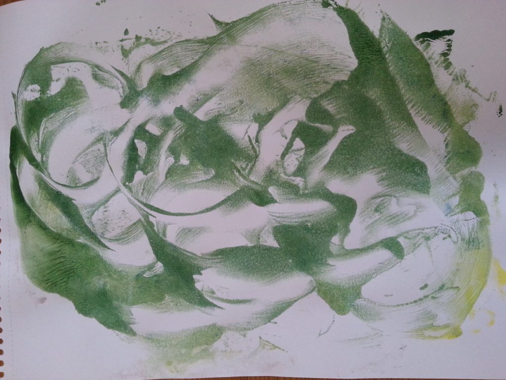
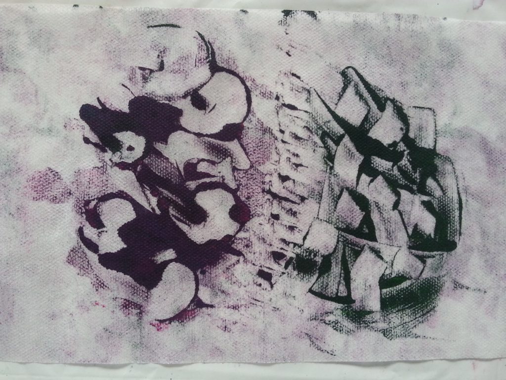
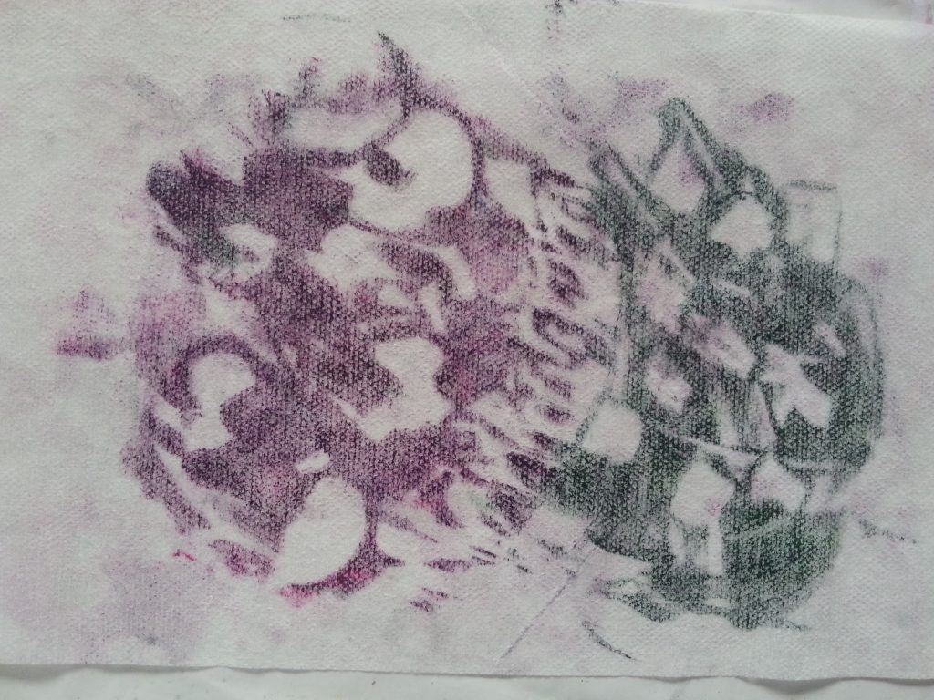
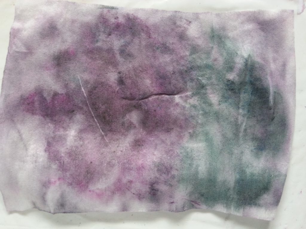
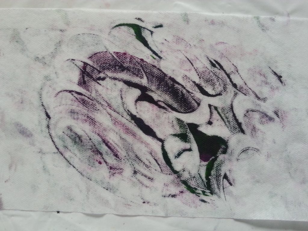
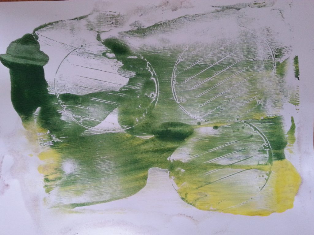
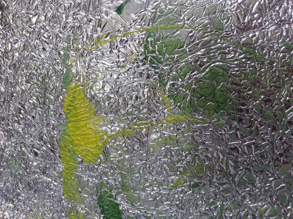
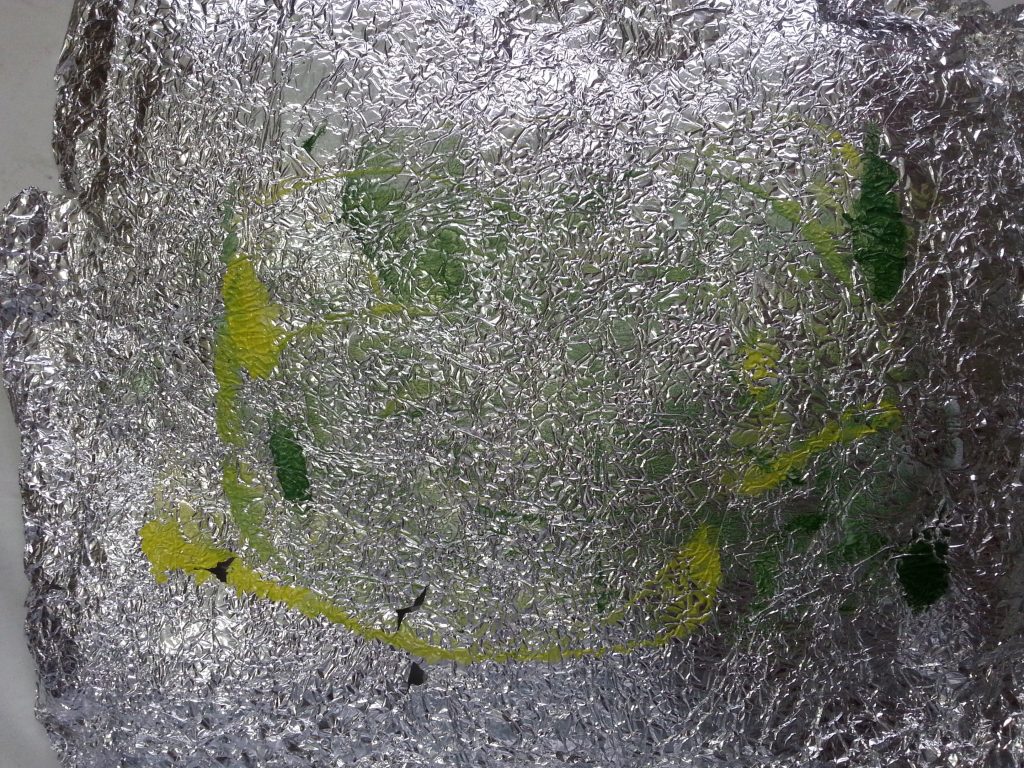
The plastic for these samples was crunchy rather than soft and gave crisp impressions with lots of fine detail on some of the surfaces. The aluminium foil was essentially unsuccessful, perhaps due to the paint being inappropriate for the surface (the paint didn’t adhere). The green/white/yellow print was particularly pleasing as it gave very delicate detail. This would make a good background for working onto/into. However, I am not sure this would be as effective on fabric. Re-scrumpling the plastic gave different effects and on the black/yellow sample I also twisted the plastic on the plate rather than simply pressing into the plate. This created additional swirling lines which were quite exciting.
These patterns are very unpredictable, making them vibrant and fun.
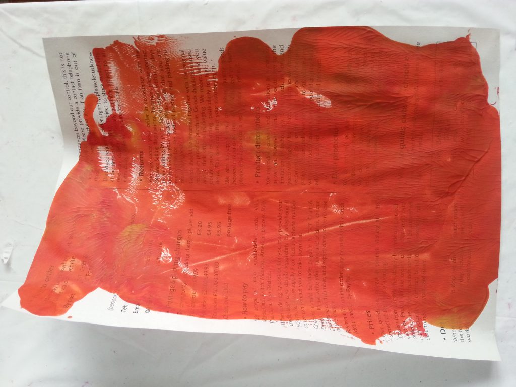
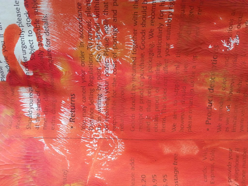
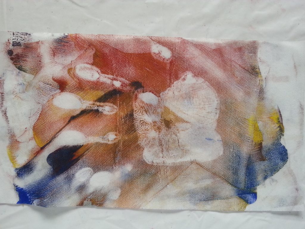
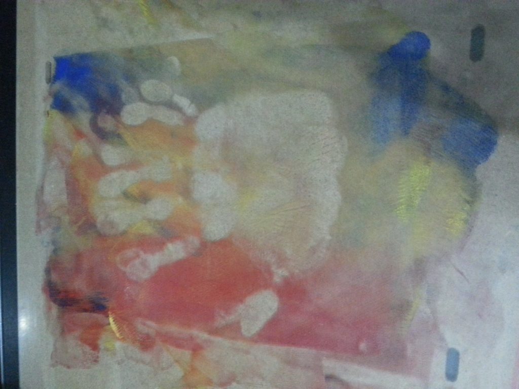
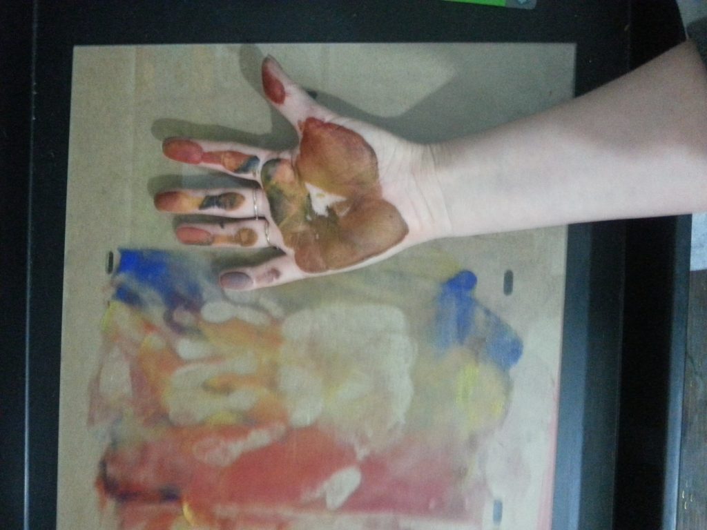
Handprint
-
- OCA MMT Assignment 4 – Monoprinting – Exercise One – Mark-making – Handprint
-
- OCA MMT Assignment 4 – Monoprinting – Exercise One – Mark-making – Handprint
-
- OCA MMT Assignment 4 – Monoprinting – Exercise One – Mark-making – Handprint
-
- OCA MMT Assignment 4 – Monoprinting – Exercise One – Mark-making – Handprint
-
- OCA MMT Assignment 4 – Monoprinting – Exercise One – Mark-making – Handprint
-
- OCA MMT Assignment 4 – Monoprinting – Exercise One – Mark-making – Handprint
-
- OCA MMT Assignment 4 – Monoprinting – Exercise One – Mark-making – Handprint
-
- OCA MMT Assignment 4 – Monoprinting – Exercise One – Mark-making – Handprint
-
- OCA MMT Assignment 4 – Monoprinting – Exercise One – Mark-making – Handprint
As I was using non-toxic acrylic paint and had inadvertently made fingerprints on the plate during the application and cleaning process I thought it would be interesting to use my full hand as a mark-making medium. After applying the paint and rolling, I pressed my hand onto the plate, pushing it down with the other hand. I worked on tumble dryer sheet as I felt this would have a little softness and pliability to take a good imprint.
I was really pleased with this effect. The print picks up both the outline of the hand but even the detailed lines on the fingers and palm. I can see lots of potential for trying this with other body parts. I am not sure if the print would be as successful on other fabrics but would like to try these.
Crumpled paper
-
- MMT Assignment 4 – Monoprinting – Exercise One – Mark-making – Crumpled paper
-
- MMT Assignment 4 – Monoprinting – Exercise One – Mark-making – Crumpled paper
-
- MMT Assignment 4 – Monoprinting – Exercise One – Mark-making – Crumpled paper
-
- MMT Assignment 4 – Monoprinting – Exercise One – Mark-making – Crumpled paper
-
- MMT Assignment 4 – Monoprinting – Exercise One – Mark-making – Crumpled paper
This last sample took an alternative approach, using scrumpled paper both to imprint the plate and to take the print. The combination of ink lines and the deep lines of the paper folds create a dramatic, bold image. This could be taken off as an image and printed onto fabric using the inkjet transfer technique. It would also be interesting to unfold and re-scrumple the paper. This would be an exciting way to extend the work on folding and crumpling and particular the work I did inspired by Vincent Floderer in Assignment One.
Thoughts and conclusions
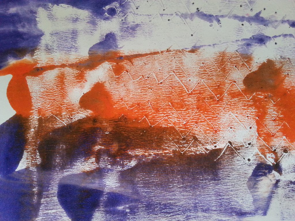
Getting the correct amount of paint on the plate was important, particularly with this exercise. With a number of prints, for example the plastic lid, having too much paint simply smeared the imprinted shapes when the paper was applied and the paper brayed. However, if the plate was too dry, the print stuck to the plate or produced a poor quality reproduction.
Using different surfaces and holding the mark-making tool at different angles and pressures created a range of images. For example, the credit card was very useful for swooping curves, smooth edges, fine points and solid lines. It had a little flexibility, enough to bend and create shapes but not too soft so as to be indistinct or ineffective.
The substrate also made a difference to the prints. Tumble dryer sheets are very effective for printing. They are not particularly strong but the slight translucency means that they will be useful for layering, working into and manipulating. They also absorb some of the paint, making the prints softer and more muted. The slight stretch in the sheets, especially when damp, gives less crisp prints at the edges. Paper gives more defined edges to prints, for example with the potato masher and the hairdye brush.
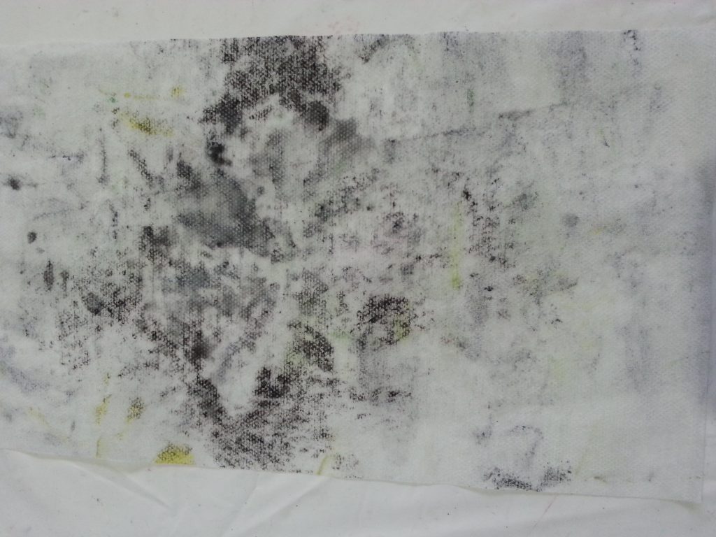
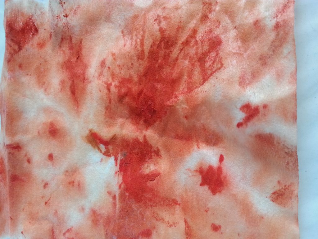
For this exercise I was not particularly concerned with colour, more with establishing the thickness of paint, the methods of application and the different ways in which colours could be blended. I also explored the negative spaces where the paint was removed either during the mark-making process or by the first pull in prints where multiple pulls were made. By spritzing the plate with water I could re-wet the last remaining paint. Initially I did this to remove the paint but it actually proved quite effective for creating ghost images of the prints (the final handprint and the first black/yellow print with scrumpled plastic).
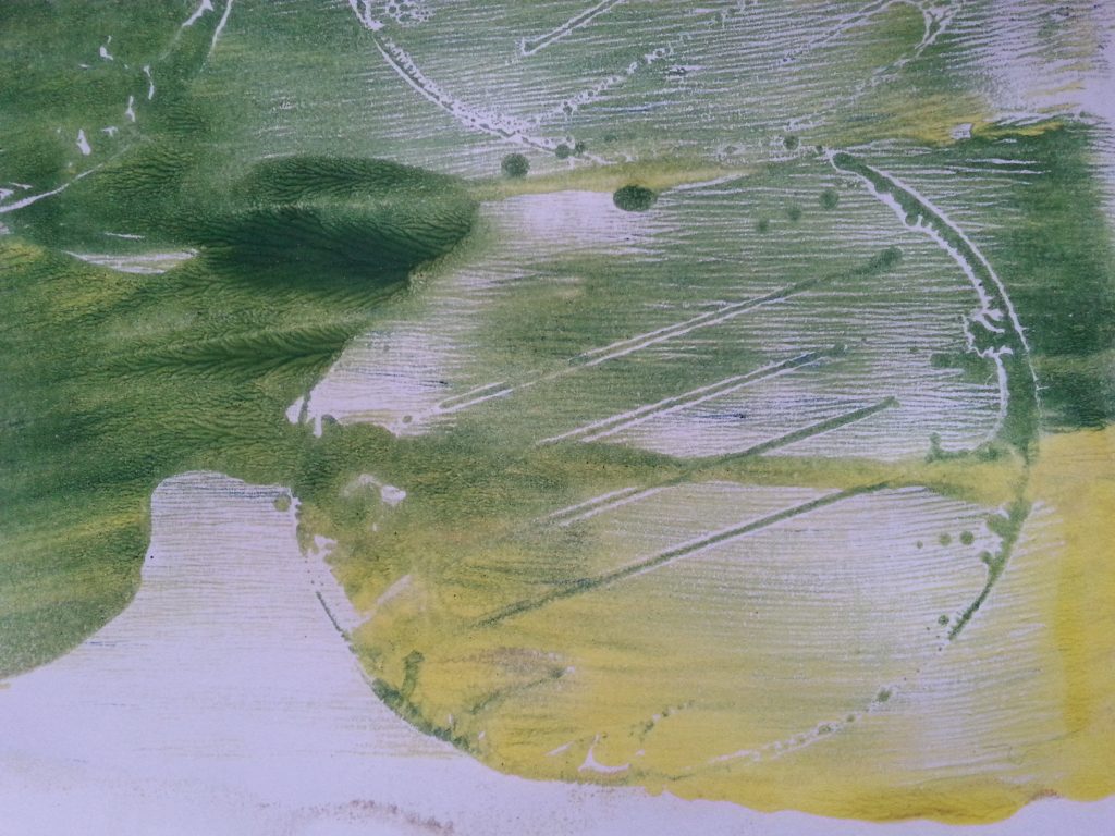
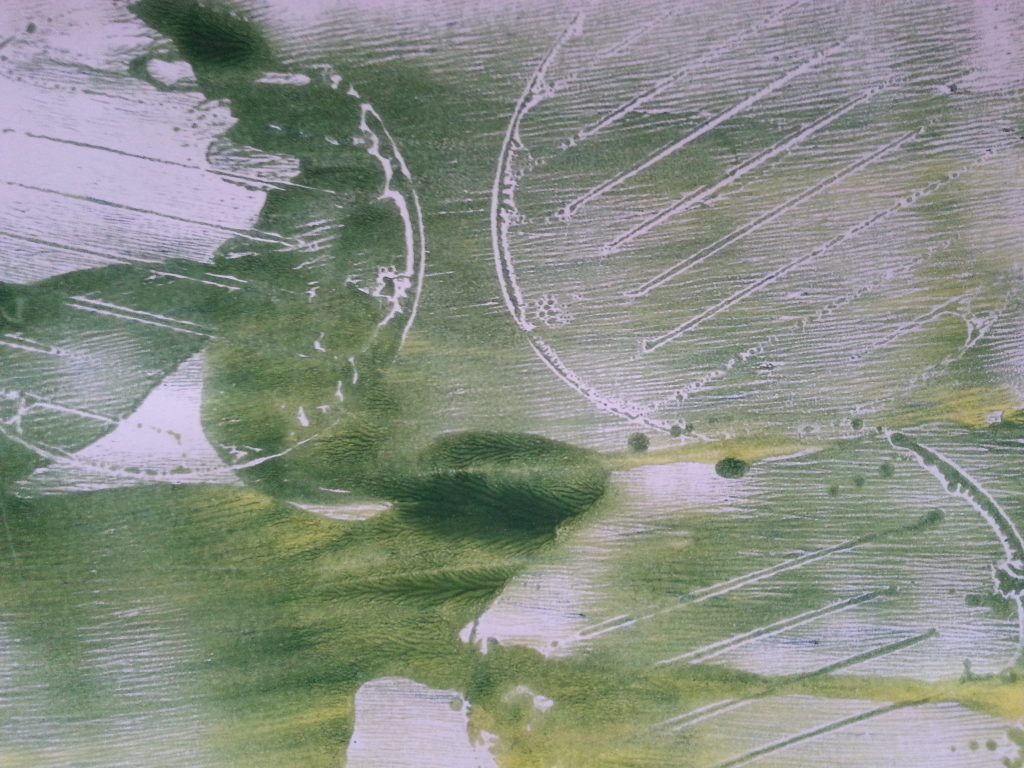
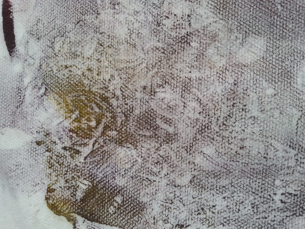
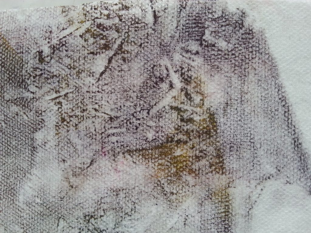
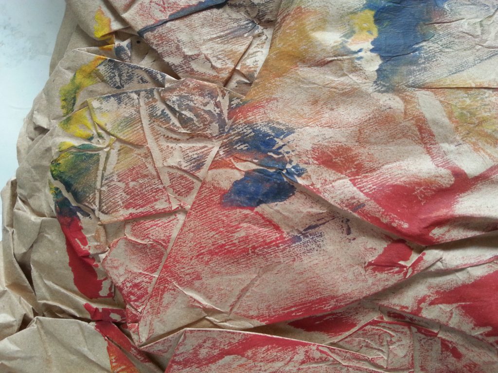
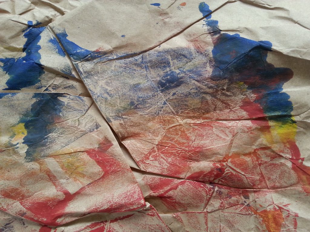
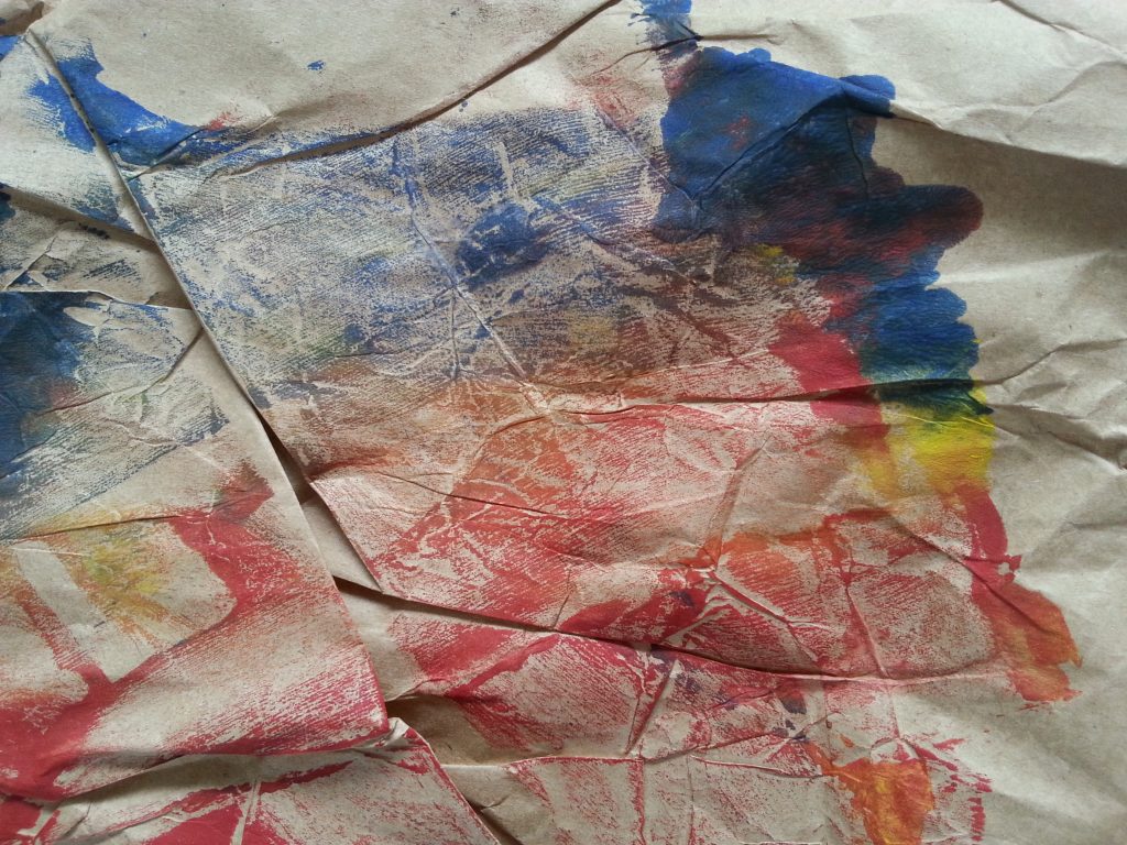
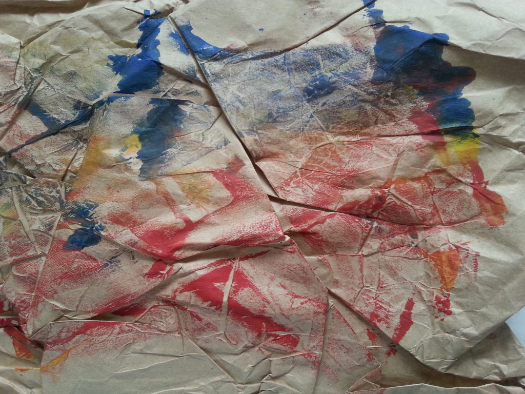
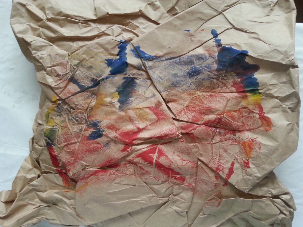
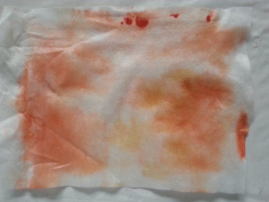
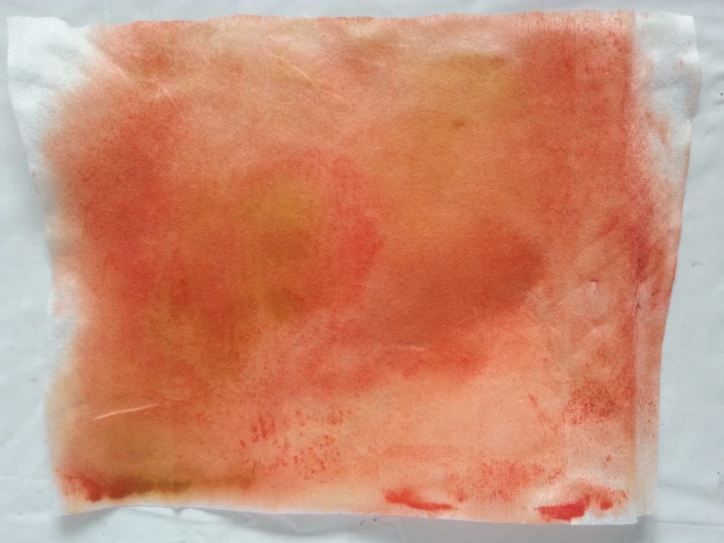
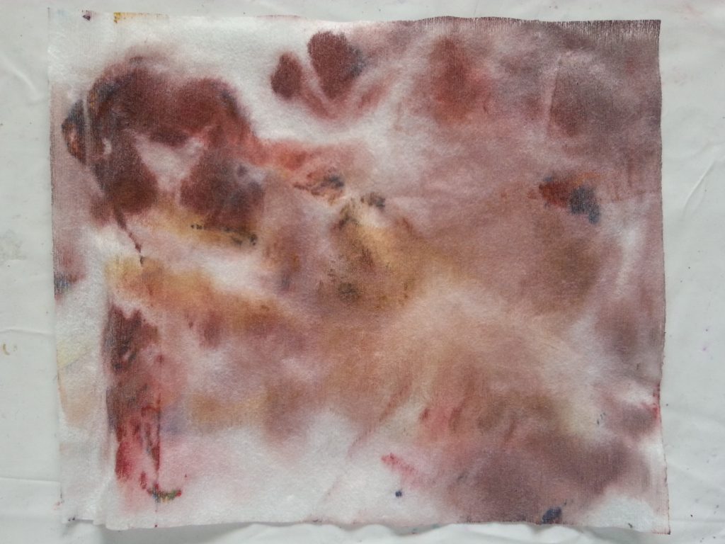
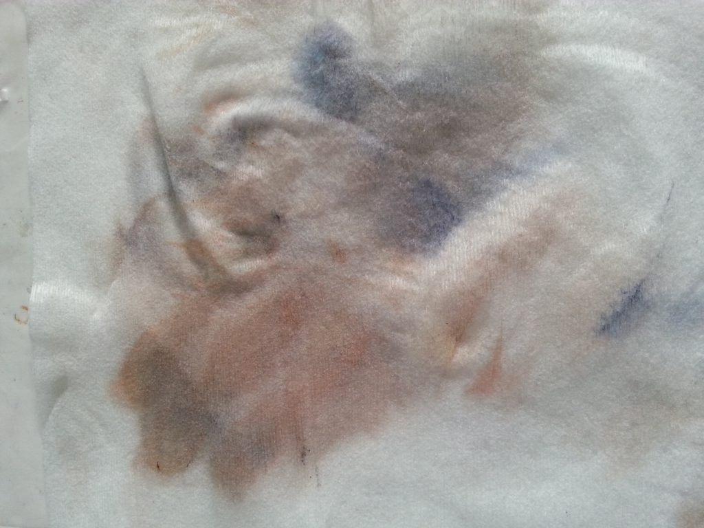
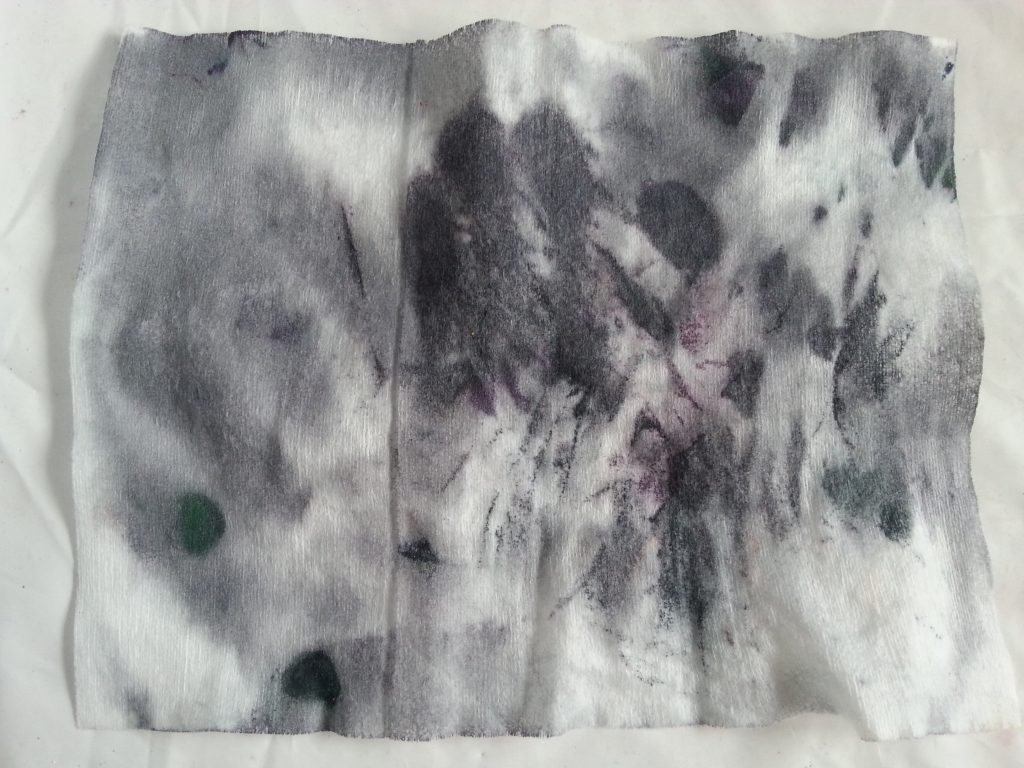
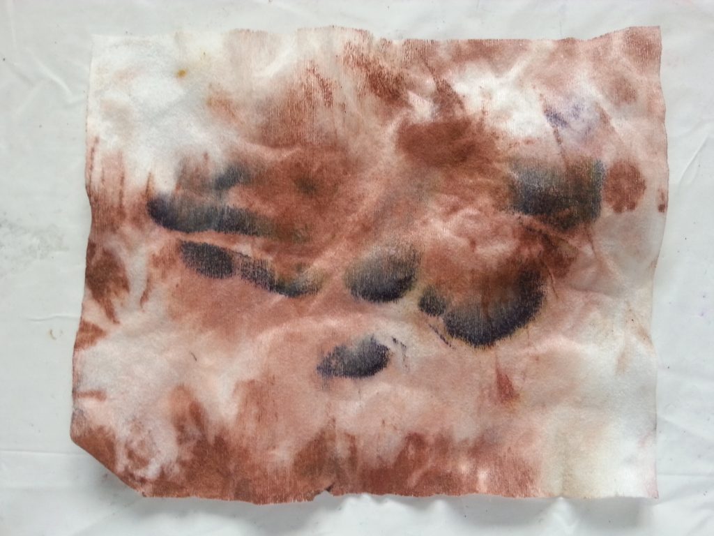
For this and the other methods, I took inspiration from textile artist Isobel Hall’s who works with a range of substrates including tumble dryer sheets. She also uses wet wipes to clean her print plates, subsequently drying these for embellishing and stitching. With this in mind, when cleaning the plate I used additional techniques, scrunching, folding, pressing and twisting the sheets as I took off the remaining paint. This has created some excellent surfaces for future work, such as the examples below:
-
- MMT Assignment 4 – Monoprinting – Exercise One – Mark-making – Scrunching
-
- MMT Assignment 4 – Monoprinting – Exercise One – Mark-making – Scrunching
-
- MMT Assignment 4 – Monoprinting – Exercise One – Mark-making – Scrunching
-
- OCA MMT Assignment 4 – Monoprinting – Exercise Two – Back drawing – Handprint
-

- OCA MMT Assignment 4 – Monoprinting – Exercise Two – Back drawing – Handprint
-
- OCA MMT Assignment 4 – Monoprinting – Exercise Two – Back drawing – Handprint
-
- OCA MMT Assignment 4 – Monoprinting – Exercise Two – Back drawing – Handprint
-
- OCA MMT Assignment 4 – Monoprinting – Exercise Two – Back drawing – Handprint