Whilst researching print artists I came upon the Veteran Print Project. Established by Yvette M Pino in 2013, the project records the experiences of veterans, expressed in print.
A number of artists have worked on the project since its inception and each print is the artist’s response to dialogue with an invidual veteran. Each image is beautiful in its own way as a piece of art, but also as a life story – sometimes sad, sometimes joyful, often humbling. It is this use of art as a means of expressing human emotion and experience that draws me to it. This is neatly encapsulated in the strapline of the media kit for the project “We see what you’re saying“. It resonates with my work in Assignment Two “Do you see what I see?” In this assignment I challenged the nature of our perceptions without dialogue – what do we assume, how does the addition of dialogue enhance and expand our understanding, tolerance and acceptance of each other? What is the purpose of dialogue in fulfillling our need to understand each other? Are dialogue and perception intrinsically and inextricably linked to a fuller understanding of our fellow man?
Whilst I could select many images, the following images from the project were particularly striking to me:
Evolution of Perspective
Simple use of two very earthy shades give this print weight and depth. They are both natural, hopeful but also heavy and oppressive. The soldier and woman are faint and small, they appear weighed down by the earth and buildings above but their interaction seems oblivious to the outside world bearing down on them.
It is difficult to ‘deconstruct’ the print method but it would appear to be colour inked on the plate in layers with implements used to remove areas of colour and add the earthy, rough texturing. Based on watching technique videos, the black lines are perhaps back drawing? In terms of my own work this is a good example of how to exploit removing colour from the plate to create texture, highlight and interest without the use of an extensive colour palette.
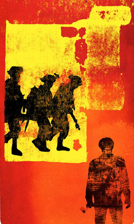
As with Roth’s print, Lenaway also uses a simple but dramatic colour palette. The image of soldiers watching a movie behind a barbed wire fence is a powerful one – a very ordinary activity that continues even in extreme surroundings.
From a painterly perspective, the black lines again appear to be backdrawn? giving them strong visual impact. As detailing is something that I found difficult I have since researched this technique and will hopefully have the opportunity to practice it in the future.
I selected this image for the creative use of bold shapes and patterns to create texture in the landscape. The use of almost collage-like shapes gives definition and the clever use of depth of shade also creates a sense, both of movement on the ground, and stillness in the air.
Not at Ease
Strangers and cupcakes by Jonas Angelet
A complete contrast in style, and something which I could perhaps use as inspiration using a stencil-based technique, this image has in common the theme of communication and dialogue.
Angelet cleverly uses a near mirror-image print to encourage us to think about our neighbours and how we might improve our daily dialogue, and thereby our understanding, by a simple exchange of small gifts like cupcakes.
An interesting image both for its message and bold, almost pop-art style.
There are many more images in this project and it is well worth setting aside an hour to visit the website and explore the stories behind the prints in more detail.
Veteran Print Project. (2017). Veteran Print Project. [online] Available at: http://veteranprintproject.com/ [Accessed 4 Apr. 2017].